
European vs. U.S. Economic Performance: An Update
Today’s primer is a long, dense, wonkish discussion of an issue I’ve been steadily working on in the background. To be honest, this post is aimed primarily at economists, not a general audience. And I may well get professional pushback — in fact I hope I will. Anyway, apologies in advance for its relative inaccessibility, which I don’t intend to make a habit.
Europe is an economic superpower that has given its residents extraordinarily good lives both by historical standards and compared with the rest of the world. Yes, Europeans have smaller houses and cars than Americans do. Many of them also, as everyone has lately become aware, lack air conditioning. But they have much more economic security than most Americans, lower economic inequality, longer life expectancy, and more leisure time.
There is, however, a widespread perception that Europe is living off its past glories, that it is lagging behind America and China in ways that will undermine its ability to maintain its economic standing in the world. This perception rests in part on the undeniable fact that Europe is home to few of the biggest technology companies and is almost completely shut out of the AI boom. It also reflects widely cited statistics: The most commonly discussed measures of growth in productivity and GDP point to an ever-growing gap between Europe and America.
But a funny thing happened on the way to inexorable European decline: If one compares either European GDP per capita or European productivity (GDP per hour) with that of the US on a year by year basis, using completely standard methods, one does not find an ever-growing gap. In fact, the gap between Europe and America has, if anything, narrowed somewhat over the past 25 years.
Understanding Europe’s economic performance is of huge importance, not just for Europeans, but for the rest of the world. The stakes go beyond economics. With authoritarianism on the rise in America, Europe is now the world’s great bastion of democracy. Hence it is important that it maintain its standing as a counterbalance to the US and China. Furthermore, Europe’s economic performance relative to the U.S. is often cited as a data point in debates on economic and social policy. Thus it’s important to understand what that record actually shows.
Finally, wearing my professional economist hat, what I call the US-EU paradox is interesting. We have two ways of comparing major economies: one based on measured economic growth, one based on measured purchasing power. Both comparisons involve orthodox, widely accepted procedures. Both are carried out by eminently respectable statisticians and agencies. Yet they lead to starkly different conclusions. One says that Europe is in relative decline, while the other says it isn’t.
I was first alerted to this strange dissonance in a February 2026 post by Seth Ackerman. Since then I’ve been trying to make sense of the apparent contradiction.
Today’s post is a detour from my ongoing series on the implications of AI, which I plan to return to next week. Here I will offer a wonkish progress report on my recent efforts to unpack the US-EU paradox. I will argue that the preponderance of the evidence supports the view that Europe is not in relative decline. I will show that comparisons that seem to show Europe lagging ignore important qualifications – qualifications that can render those comparisons misleading. First, there is a big difference between the EU and the US in industrial mix: the U.S. economy is more highly concentrated than Europe in “tech”, which creates a divergence in measured growth but not in living standards. Second, it is inherently difficult to measure growth in the face of technological change – a problem that doesn’t arise, notably, when comparing economies at a given point in time.
Beyond the paywall I’ll address the following:
1. The US-EU paradox and why it matters
2. Dollars, PPP and Big Macs: Measuring purchasing power
3. Understanding the growth discrepancy 1: Industrial mix
4. Understanding the growth discrepancy 2: Measurement
5. What about consumption?
6. Lessons from the US-EU comparison
The US-EU paradox and why it matters
In 2024 the European Commission released “The future of European competitiveness,” a report prepared under the direction of Mario Draghi, the former president of the European Central Bank. The report opened with a statistical assertion:
Europe has been worrying about slowing growth since the start of this century. Various strategies to raise growth rates have come and gone, but the trend has remained unchanged.
Across different metrics, a wide gap in GDP has opened up between the EU and the US, driven mainly by a more pronounced slowdown in productivity growth in Europe.
Draghi, in addition to being in my view history’s greatest central banker, is what we might call a European patriot — a believer in Europe’s achievements, above all its success in delivering a decent society. While his report warns about a lagging economy and calls for reforms, it is careful to say that it isn’t calling for dismantling the social safety net.
Others are less restrained. At Davos in January Howard Lutnick, the U.S. Commerce secretary, gave a dinner speech in which he insulted the Europeans over what he asserted was their poor economic performance, prompting Christine Lagarde, the ECB’s current president, to walk out.
On behalf of my nation, I apologize for Lutnick’s crudeness. But the underlying data that his assertions were based upon seem clear. Chart 1 shows real GDP per capita in the United States and the euro area (the 20 nations that now use the euro as their shared currency), as estimated by the Bureau of Economic Analysis and its counterparts in other nations, with 2000 set equal to 100:
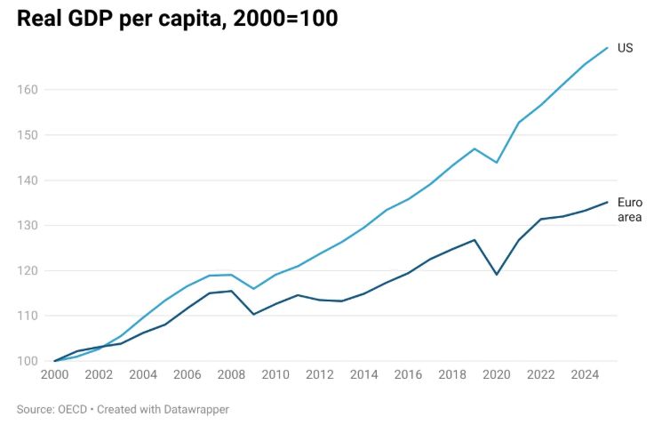
Chart 1
Clearly, Europe has been falling steadily behind.
Or has it? There is another way to compare national economies. Rather than basing the comparison on growth in GDP per capita, this method looks at relative incomes at each point of time, adjusting these incomes to reflect international differences in the overall level of prices. Like GDP data, these “purchasing power parity” (PPP) numbers come from a large-scale, ultra-respectable institutional effort, in this case the World Bank’s International Comparison Program. Chart 2 shows the euro area’s per capita GDP relative to that of the United States expressed as a percentage:
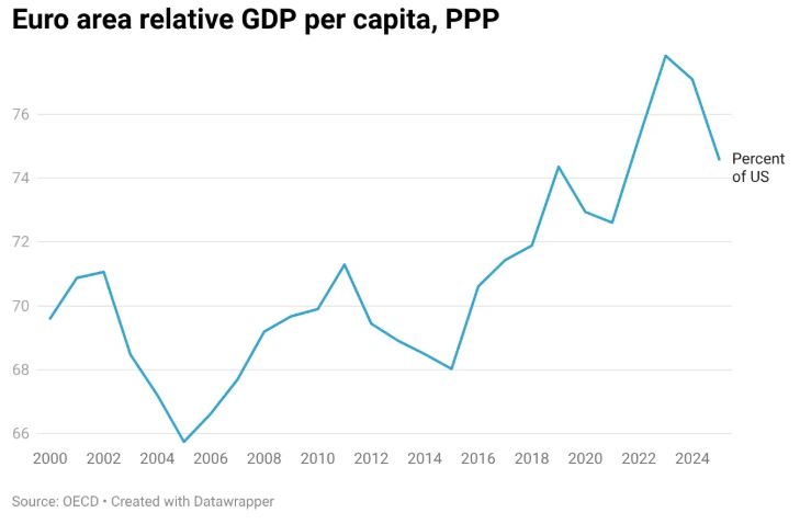
Chart 2
Wait, where’s the widening gap? According to this data, the gap between Europe and the U.S. is significantly smaller than it was 25 years ago. Granted, Europe has consistently had lower income than the US, which reflects a combination of lower productivity and shorter working hours. But the gap has narrowed somewhat over time.
That, in a nutshell, is the US-EU paradox: There are two standard measures of relative performance, both estimated through major statistical efforts, that tell completely different stories. One set of measures shows Europe increasingly lagging behind the United States. The other shows Europe holding its own and possibly even gaining.
Why does it matter which of these stories is true? There are at least three reasons:
· Geopolitics: Europe’s future influence will depend greatly on whether or not it’s in long-term relative economic decline
· Fiscal sustainability: If Europe is losing competitiveness, this might undermine its ability to maintain a strong social safety net
· Politics: Conservatives, especially but not only in the US, often seize on Europe’s supposed economic decline to declare that the European model — relatively high taxes and a strong safety net combined with extensive labor protections — doesn’t work and that more ruthless American-style capitalism is the only way forward. Call this the Lutnick doctrine.
On that last point, the argument that Europe is not, in fact, in decline also risks political capture. Some European economists I have spoken to worry that anti-declinism analyses may empower interest groups that oppose all European reform. I’ll come back to that concern at the end of this post.
Let’s be clear: However you think data on European economic performance might be used or abused, that shouldn’t matter for your assessment. Truth comes first.
Yet how we resolve the US-EU paradox matters. What explains it? Let me start with purchasing power comparisons, which are less familiar to many people than economic growth comparisons.
Dollars, PPP and Big Macs: Understanding purchasing power
Chart 2 showed relative European GDP per capita at purchasing power parity, also known as PPP. That is, it shows the value of goods and services produced in each economy per person, adjusted for differences in the overall level of pricesbetween the two economies.
When I’ve written about these numbers before, however, some readers have asked a good question: Why do we need to adjust for prices? Why not just look at dollar values?
The answer is that we must adjust for prices because European GDP per capita in dollar terms is wildly volatile, owing to the fact that it moves with the exchange rate — the number of dollars per euro. Chart 3 shows what I’m talking about. It compares relative European GDP per capita in dollar terms with the dollar/euro exchange rate:
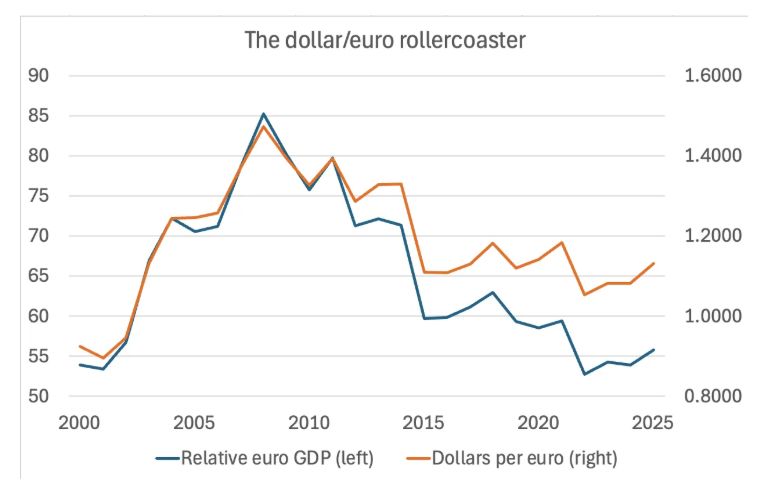
Chart 3
As the blue and orange lines show, relative European GDP per capita in dollar terms closely track fluctuations in the dollar per euro exchange rate. Thus it would be misleading to rely on a measure of European GDP expressed in dollars. I sometimes see articles that compare US and European GDP since 2008 and conclude that Europe is in catastrophic decline. What they are mostly seeing, however, is the fact that the euro was very strong in 2008 and has gotten much weaker since.
Therefore, dollar values of GDP must be adjusted for changes in national price levels in dollars, which also move with the exchange rate, to get a meaningful picture of trends in GDP and income. The best way to do this is to rely on the numbers produced by the International Comparison Program. There is no reason to question these numbers: the ICP is a comprehensive, massive effort conducted by professionals who are doing their best to get at the truth, not serving an agenda.
What makes the US-EU paradox so troubling is that estimates of economic growth produced by national statistical agencies are equally credible. Yet standard growth estimates and PPP estimates seem to tell quite different stories about the relative performance of the EU and the US. This divergence creates at least a slight, nagging doubt: Is there something about the way PPP estimates are calculated that leads to a bias in how we measure the trend in European economic performance?
Obviously I can’t replicate, let alone challenge, the massive efforts that go into international price comparisons. But it occurred to me that I can do a plausibility check by comparing these results with a crude, silly, but independent estimate of purchasing power parity: the Big Mac index.
For those who haven’t heard of this index, the magazine The Economist regularly publishes estimates of currency over- and under-valuation based on the price of one standardized item sold around the world: The McDonalds Big Mac. So what happens if we compare US and euro area GDP per capita measured not in dollars but in Big Macs? Chart 4 shows the answer:
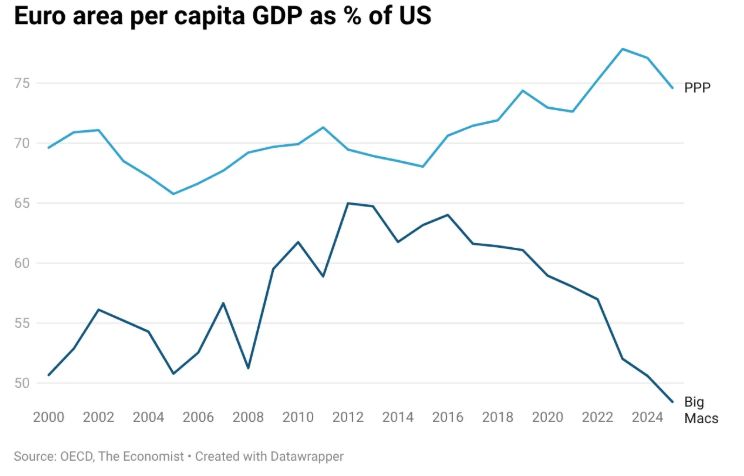
Chart 4
I offer three observations about Chart 4. First, European income measured in Big Macs looks lower than using a broader measure of prices. But that’s not surprising. European nations impose high value-added taxes that raise consumer prices while helping to pay for social benefits. Furthermore, European labor institutions raise wages for occupations that are low wage in the US, and this is coupled with additional taxes that raise cost to employers. Thus the price of a Big Mac in Europe is higher than in the U.S. because of these added costs, which will in turn reduce European GDP per capita based on the Big-Mac-index relative to one based on the PPP index. And while Europeans may pay more for Big Macs, they receive higher social benefits as compensation.
Second, Big-Mac-adjusted GDP is much more volatile than PPP-adjusted-GDP. This is also not surprising, both because The Economist does a limited survey and because burger prices are affected by idiosyncratic factors. Until 2022 fluctuations in Big Mac adjusted relative GDP were within a relatively contained range. What’s behind the big drop-off starting in 2022? While I don’t want to turn this post into a dissertation on fast food economics, the European Central Bank has shown that there was a huge rise in European food prices after Russia invaded Ukraine which would explain this change in the trend.
Third, abstracting from the noisiness of the measure, and especially discounting that implausible late plunge, European Big Mac GDP is broadly consistent with the story told by purchasing power parity. In 2022 Europe’s relative Big Mac GDP was higher than it had been in the early 2000s, and even after the odd plunge since 2022, the numbers suggest that Europe has more or less held its own over time, with the gap versus the US if anything narrowing slightly.
This is, I believe, the truth about European economic performance. But how can it be reconciled with growth comparisons like those shown in Chart 1?
Understanding the growth discrepancy 1: Industrial mix
The Draghi report makes a very interesting assertion about the US versus EU productivity growth gap, asserting that it’s basically all due to much larger U.S. gains from the rise of the ICT (information, communication and technology) sector, defined as computer manufacturing plus information and communication services. The report states that, apart from the ICT sectors in the EU and the US, productivity performance across the rest of the two economies has been similar.
I have been working with the EU KLEMS data that is the basis for that assertion and have gotten a somewhat weaker result. The KLEMS data only go up through 2021, and the last two years are distorted by Covid. Also, data aren’t available for all EU members. But Chart 5 shows what I find for productivity growth rates from 2000-2019 in the US and the EU11, basically western Europe:
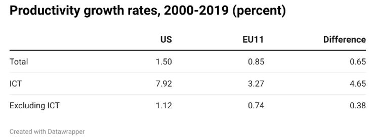
Chart 5
Overall productivity growth was higher in the US than in Europe, but almost half the difference goes away if one excludes ICT, even though the tech sector was only 9.2 percent of US GDP and 5.4 percent of EU GDP. It’s worth noting that, within the US, productivity rose much faster in tech than in the rest of the economy.
When trying to model the US-EU paradox, I focused on the difference in the share of GDP accounted for by the tech sector. In a previous post I constructed a simple model in which: (1) productivity growth is the same on both sides of the Atlantic within each sector; (2) growth is higher in tech than in non-tech; (3) the US dominates the tech sector, with most or all global tech production concentrated in America. Based on this model I argued that, in such a world, measured GDP growth will be higher in the US than in the EU, but also that EU relative purchasing power will not fall over time. That isbecause the benefits of rising US productivity in tech will be shared with consumers everywhere, including Europe. This assumes that Europe doesn’t lag in adopting technology outside the tech sector. But as noted above, the productivity gap outside tech is relatively small.
How much of the US-EU paradox can this story, which emphasizes differences in industrial mix, explain? I won’t go through the math here — economists should look at my model, and I’ll ask everyone else to trust me. In any case, the industrial-mix effect on measured economic growth comes out to
Industrial mix effect = (Share of tech in US GDP – share of tech in EU GDP) * (productivity growth rate in tech – productivity growth rate in non-tech)
If I plug in the US-EU difference in ICT share — 3.8 percentage points — and the difference within the US between productivity growth in ICT and in the rest of the economy — 6.8 percentage points — I get 0.26 percentage points, or approximately 40% of the reported overall US-EU difference in productivity growth.
This is probably an underestimate. The slow rate of ICT productivity growth in the EU suggests that within the EU ICT sector there are a substantial number of industries with relatively slow technological progress. If so, the true difference between the share of GDP in the US and the EU accounted for by tech is larger than the number I used in the above calculation. This in turn implies that the industrial mix has a bigger effect than that calculation implies. It might be more than half the story.
However, it isn’t the full story. Data on consumer spending, which I’ll get to later, make it clear that there is more to the story than just differences in industrial mix.
So what is the rest of the story? The other part of the US-EU paradox involves a statistical issue that arises from the inherent trickiness of measuring economic growth.
Understanding the growth discrepancy 2: Measurement
Economic comparisons across time and space are conceptually very similar. When we try to compare the US and EU economies using purchasing power parity, we are asking what EU GDP would be if goods and services were valued at US prices. When we assess economic growth between 2024 and 2025, we are asking what GDP in 2025 would have been if goods and services were still being sold at 2024 prices.
Estimating economic growth is, however, inherently more difficult than comparisons between economies at a given point in time, because of innovation. Suppose that we want to compare real GDP in two years separated by a relatively wide interval — say, 2000 and 2026. We can’t literally calculate the value of 2026 output at 2000 prices because there is a significant range of goods available now that either didn’t exist in 2000 or have undergone qualitative changes so large as to be essentially impossible to compare.
Consider our constant companions, smartphones. Smartphones didn’t exist in the year 2000. Apple introduced the original iPhone in 2007, at a price of $499. That’s what a Google Pixel costs now — but a 2026 Pixel is vastly more powerful than the original iPhone. So how should we measure output or the level of prices when having to account for the availability of entirely new or drastically improved goods?
Government statisticians address this problem by creating an equivalent value for new or greatly changed goods using “hedonic” adjustments -- basically they compile surveys to try to ascertain the value of innovation to consumers. They do this intelligently: Here’s their note on how they’re dealing with smartphones.
But those adjustments are enormous for tech goods. Chart 6 shows the BLS measure of the price of “consumer information items” over time, which has declined enormously:
Price of telephone hardware, calculators, and other consumer information items
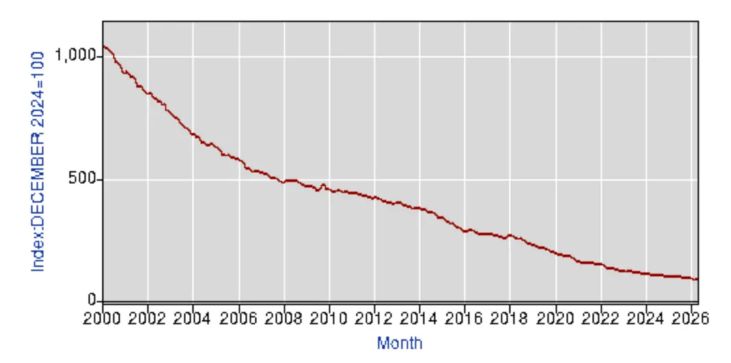
Chart 6
This is not because individual consumer gadgets have become drastically cheaper, but because the gadgets are vastly more powerful than they used to be.
Are US statisticians doing this correctly? They are certainly making a smart, good faith effort. So are statisticians in other countries. But statisticians across economies are not making the same adjustments: hedonic adjustments are quite different between economies. Seth Ackerman has a lot about this, pointing out that official indexes of prices of mobile phones, TV sets and more have wildly different trajectories in different countries.
Is America doing it right or are the Europeans doing it right? I’m not even sure that’s a meaningful question to ask. At some level there isn’t any clearly right answer when talking about real GDP or real income in the face of fundamental technological change.
The important observation for US-EU comparisons is that US statistical authorities are probably, on average, more aggressive in making hedonic adjustments than European statistical authorities — effectively, American statisticians are more optimistic in their estimates of the value of new products and new capabilities. It’s not clear who is right, and for current purposes it doesn’t matter. The point, instead, is that this difference in statistical approaches may be creating a spurious wedge between measured US and European growth rates. This would explain part of the dissonance between US-EU comparisons using these growth rates and those using purchasing power comparisons at each point in time.
Notably, point-in-time comparisons don’t suffer from the same problem: The question of what European output would be worth at US prices is well defined. Admittedly, the comparison is tricky if there are things Europe produces that America does not or vice versa. (For example, why can’t Americans make gelato as good as Italians make?) But the problem of comparisons when economies produce different mixes of goods is a much easier problem than the one created by technological change – that is, the fact that in 2000 there were no smartphones and now they are ubiquitous. So this is yet another reason why we should look at PPP-adjusted current value comparisons in assessing economic progress in United States versus economic progress in Europe. And these comparisons say that Europe is actually holding its own.
What about consumption?
One of the more acute entries in the US-EU debate is from Matthew Klein, who notes that measured consumption per hour, and also presumably per capita, has grown much more slowly in northwest Europe than in the United States. This observation is inconsistent with a story in which the entire divergence between the two economies was caused by US dominance of a rapidly progressing tech sector, whose benefits were shared globally: If that were true, measured consumption in the two economies should grow at equal rates.
But the inherent measurement problems caused by technological innovation remain, and there turns out to be a US-EU paradox on consumption too. Real consumption per capita appears to have grown much faster in the US than in the EU, but according to the OECD, purchasing-power-adjusted consumption per capita in Europe was 59 percent of the US level in 2000 — and 60 percent in 2024, with no visible growth in the gap.
Admittedly, consumption comparisons between Europe and the US introduce other complications, illustrated by the case of health care, which is sometimes private consumption in the US when it’s a public service in Europe. Also, health care is a huge part of the economy, and the US appears to consume more of its, but we get worse outcomes than Europe. Overall, consumption data don’t contradict the story that Europe is holding its own.
Lessons from the US-EU comparison
Assessing European economic performance is important, and not just for the Europeans. We should all care about what’s happening to the world‘s third largest economy. European relative decline would have huge implications and generally not good ones for the state of the world. And of course how one assesses Europe has something to do with your views about what kinds of social policies to pursue. If Europe is gradually sinking into the mud, then you would have to say that the European model of relative social justice isn’t sustainable.
I’ve argued at length in this post that Europe is doing much better than, say, Howard Lutnick would claim. Europe is not a museum, a monument to vanishing glories. By what are arguably the most important measures, Europe is holding its own against the United States.
This does not mean that everything in Europe va bene. The shifting geopolitics of the EU, the US and China is an enormous concern. In addition, despite my assertions so far, it’s true that Europe has been largely excluded from a number of cutting edge sectors such as AI and advanced chip manufacture. This is rendering Europeans dependent upon foreign powers that they can’t trust — a list that unfortunately now includes the United States.
There’s also a present danger that some European economic analysts have forcefully suggested to me: saying that Europe has not been falling behind could encourage European interests that oppose much needed reforms. Europe is probably 10 to 15% less productive than the United States. It is certainly less productive than it could and should be. And this is partly for reasons that are fixable and should have been fixed. The Draghi report stresses, in particular, the failure to create a truly integrated European market. Much of the promise of the Single European Act remains unfilled: national regulations continue to keep Europe economically fragmented, with real costs in terms of lost productivity and reduced competition.
The challenge here is to keep a sense of perspective. We can and should debunk Lutnickism. We can reject the idea that Europe is an irreversible decline. It would be tragic if the narrative of decline led Europe to abandon its achievements in social justice, allow a destructive free-for-all in AI, social media and so on. But appreciating European strengths shouldn’t mean rejecting the need for major economic reform.
Above all, however, don’t let economic analysis of Europe be driven by popular narratives that aren’t justified by the facts. The data simply do not support the extremely pessimistic European stories that are so widely circulated.
Paul Krugman: Professor, CUNY Grad Center, Nobel laureate and former columnist, NY Times. Also, according to Donald Trump, a “Deranged BUM.”
Subscribe to PaulKrugman.substack.com/subscribe