Here's a look at five decades of data:
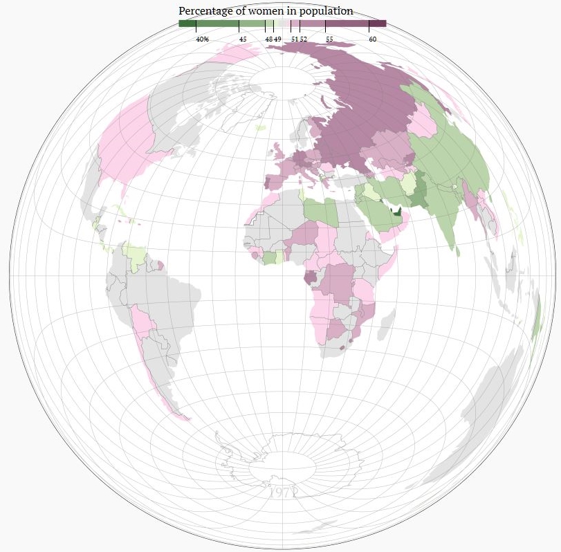
The global view
In 1971, 49.79% of the global population were women.
85 countries had a majority of women, 49 countries had a majority of men, 57 were within 0.5% of gender parity.
[Click on image to enable Interactive Features, you will be able to hover over any particular country to get percentage totals for that country.]
*No data available for American Samoa, Andorra, Bermuda, Cayman Islands, Dominica, Faeroe Islands, Greenland, Isle of Man, Kosovo, Liechtenstein, Marshall Islands, Monaco, Northern Mariana Islands, Palau, San Marino, Sint Maarten, St. Kitts and Nevis, St. Martin, Turks and Caicos Islands, Tuvalu, or SADR.
Data: World Bank
A closer look
Left to nature alone, the population on earth would be give or take 50% men and 50% women, according to what's become known as Fisher's Principle. The fact that women generally live longer (PDF, page 259) is compensated by the fact of more boys being born than girls (107 boys per 100 girls in 2013).
In 1961, the earliest year the World Bank provides data for, the world was within 0.09 percentage points of a perfectly equal distribution. Ever since, the gap has widened; now men outnumber women on the planet by almost 60 million.
The male surplus is the result of various, partly diverging trends. In 2013, female population in individual countries ranged from 23 to 55%. Some countries have seen a change of as much as 19 percentage points over the past five decades, others have had notable ups or downs within relatively short periods.
(The data, provided by the World Bank, based on the United Nations Population Division's World Population Prospects, use interpolation between five-year periods to obtain annual data. Events that caused a significant change within a relatively short time might thus be reflected in the data with a delay and appear more linear than they have in fact been.)
The missing girls in China and India
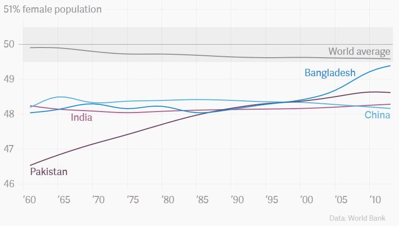
In 2013, men outnumbered women on the planet by roughly 58 million, according to the World Bank. What makes this possible, even though a majority of countries have more women than men, is the fact that the most populous countries in the world are also highly imbalanced: China has nearly 50 million more men than women, India 43 million, accounting for 76% of the male surplus worldwide.
Gender imbalance starts at birth: Both China and India are infamous for widespread gender selective abortions and female infanticide. Both countries have birth sex ratios that are well off the worldwide average. In 2013, China saw 1.11 boys born per girl, India 1.12, as compared to 1.07 worldwide. The availability of affordable prenatal diagnostic techniques has only accentuated the trend, which means the gender gap in the general population is bound to widen in the coming years, as more balanced older generations pass away. In an attempt to break the trend, India has legally banned sex determination before birth in 1994, legislation that has, however, been criticized as ineffective. In 2013, China loosened its one-child policy, one of the main drivers of gendercide.
Two other countries in the region with a similar population structure, Pakistan and Bangladesh, have seen significant changes over the past decades. While Pakistan, the most unbalanced of the four in 1961, has improved and moved past China and India to greater equity, Bangladesh is approaching a balanced population in this century. This can be attributed to a shift in culture-labelled "the rise of the daughter-in-law" phenomenon - from one that strongly preferred sons to one that values boys and girls equally.
Migrant workers on the Arabian Peninsula
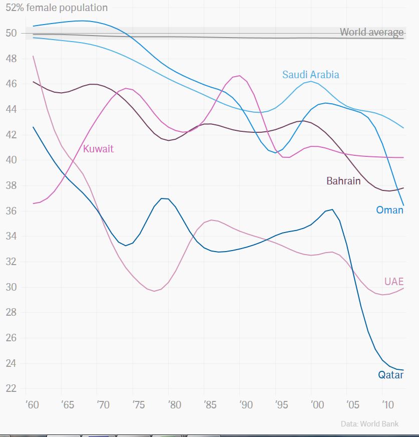
The most gender imbalanced states in 2013 were all found on the Arabian Peninsula, Qatar being the most extreme. Less than one quarter of all people who lived in Qatar in 2013 were women. Those countries have attracted a lot of migrant workers for male-dominated industries, especially after oil prices started rising in the 1970s and the industry grew. Millions of men, mostly from South Asia, came to work on the Arabian Peninsula, but weren't allowed to bring their spouses and children with them, thus throwing gender ratios off balance.
Heavy drinking in Russia
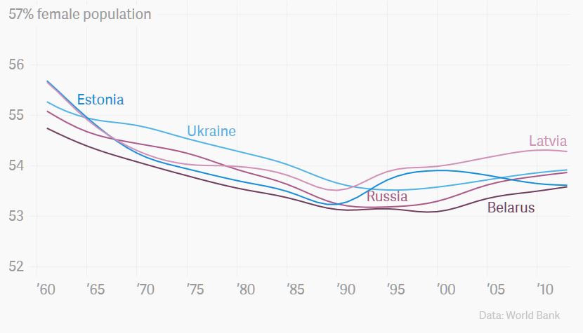
The former Soviet states are notorious for men's short life expectancy, which is largely attributed to alcohol-related deaths. Strikingly, Russia currently has more than twice as many women than men above the age of 65. According to the WHO, women in Russia live, on average, 12 years longer than men, a larger difference than anywhere else in the world. The only countries that come close are other former states of the Soviet Union. It is this difference in life expectancy that makes the population in those states particularly female.
There is, however, another striking development in most former Soviet states. Their populations moved toward more gender balance, up until the dissolution of the Soviet Union, when the trend reversed. The extraordinarily high percentages of women in 1961 were still an effect of World War II, when the Soviet Union lost close to 15% of its population, many of them young men. As time passed, this effect diminished, bringing down gender imbalance, albeit still at world-record level.
However, the dissolution of the Soviet Union and the subsequent healthcare crisis lead to a sudden increase in mortality, for men more so than women. Between 1991 and 1994, average life expectancy dropped by six years for men, three for women.
War and genocide in Rwanda, Cambodia and Iraq
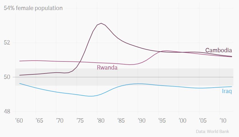
Disruptive events such as wars and genocides show in the data as well. Since they tend to claim more men's lives than women's, the population's sex ratio usually shifts female.
As you can see in the chart, both the Iraq-Iran war in the 1980s and the genocide in Rwanda in 1994 left those countries with a significantly more female population than before. Even more staggering is the effect of the mass killings by the Khmer Rouge in Cambodia from 1975 to 1978, when around a quarter of the entire population died.
The homogenous top
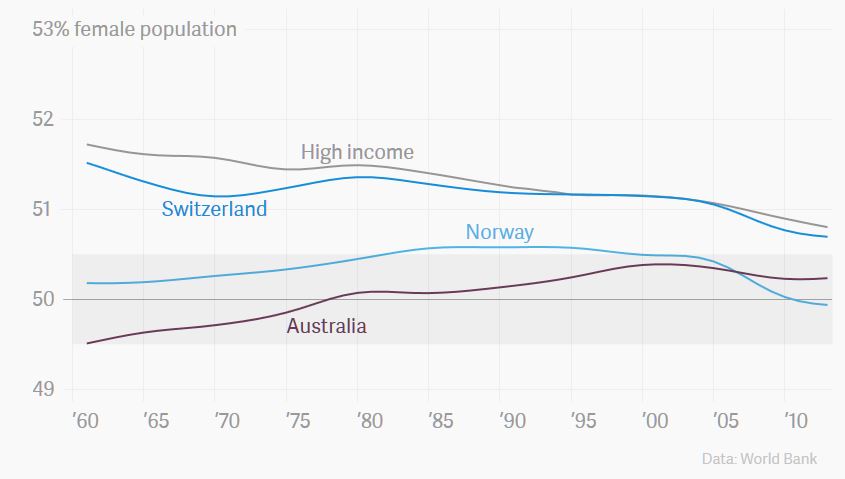
One of the strongest predictors of a country's sex ratio is how developed it is. Highly developed countries tend to have more women in their population. Thirteen of the top 15 countries in the Human Development Index (which measures health, education and prosperity) and 29 of 31 "high-income OECD states" (as defined by the World Bank) have a female population above 50%. The only exceptions in both rankings, Iceland with 49.66% women and Norway with 49.93% women, are not far off, either. Included in the chart are the top three nations from the 2014 Human Development Index: Norway, Australia and Switzerland.
What most of these countries have in common-and what is certainly true for the average of all of them-is that over the past decades there is a trend toward a more balanced population. The gap between men's and women's life expectancy has narrowed largely due to occupations and lifestyles becoming more similar. While the difference for "more developed regions" was 7.8 years between 1985-1990, it now stands at 6.8 years (PDF, page 258).
The diverse BRICS states
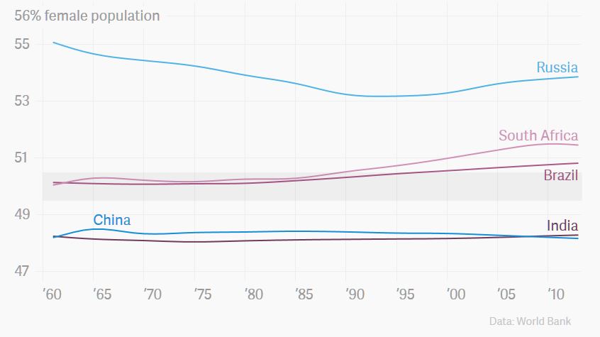
We've seen that highly developed countries are quite homogenous in terms of gender ratios. In contrast, the four big emerging economies of the BRICS states strikingly fall into three groups.
China and India are strongly imbalanced toward men, Russia even more strongly imbalanced toward women, with Brazil and South Africa firmly somewhere in between. In Brazil, a widening gap in life expectancy has made the population shift from almost perfectly balanced toward female. In 1960, women were expected to live four years longer than men; today this difference is seven years.
The surprisingly balanced African states
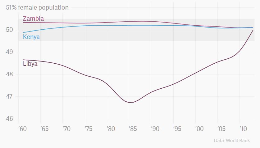
Africa's population is more gender balanced than any other continent's was in 2013. In fact, a majority of countries in Africa has both genders within 49.5% and 50.5% of the total population. At first glance, they resemble the likes of Sweden and Norway, but the balance results from different circumstances.
Most of those countries have an at-birth sex ratio that is significantly lower than the world average, around 103 boys per 100 girls. There is no conclusive evidence on why this is the case. However, both the climate near the equator and malnutrition of mothers during pregnancy are believed to contribute to a higher mortality of male fetuses.
Over time, this should result in women outnumbering men. It doesn't happen, though, because women, on average, outlive men by fewer years than elsewhere. In Sub-Saharan Africa, the difference in life-expectancy at birth is 2.4 years, as compared to 6.8 years in "more developed regions" (PDF, page 259).
Then, some countries are balanced in 2013, but only as the result of a dramatic shift. The prime example for this is Libya. Its female population rose from less than 47% in 1985-one of the lowest in the world-to 50% in 2013. As is typical for countries with relatively small populations, the trend-reversal coincides with changes in migration.
Every year until 1985, more people migrated to Libya than left Libya. As nearly 2 in 3 immigrants were male, the country's total population became increasingly male. Starting in the late 1980s, and increasing since, more people have left Libya than immigrated to it. As, again, more men than women have left the country, the effect on the population reversed.
The US and its neighbors
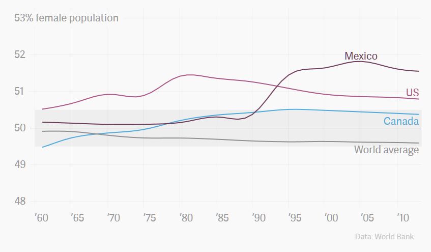
Looking at five decades of sex ratios in North America, Mexico's development stands out: it's clear how the mass emigration from Mexico to USA starting in the 1990s significantly changed the sex ratio in Mexico. Between 1990 and 2010, more than 7.5 million Mexican immigrants crossed the border to the US. Since more men than women left Mexico, the ratio of women in the Mexican population rose sharply (in its population dataset, the World Bank counts residents regardless of legal status or citizenship, and men outnumber women especially in illegal migration).
Mexico is representative of a general trend here: historically, migration has had an effect on sex ratios since significantly more men than women have migrated. The more migrants, incoming or outgoing, a country had relative to its population, the stronger the effect, as we've already seen for Qatar or Libya. As women's share in migration is rising, from 47.4% in 1975 to 49.6% in 2005, the effect on gender imbalance is weakening, though.
Both the United States and Canada have seen an increase in women's share in the population from the 1960s onward, followed by a slight rebound toward a more balanced population in recent years. In both countries, these developments can be explained by the difference in life expectancy between men and women, which had widened after 1960 and narrowed again starting in the `80s and `90s, a trend most highly developed countries have seen.
Hong Kong's single ladies
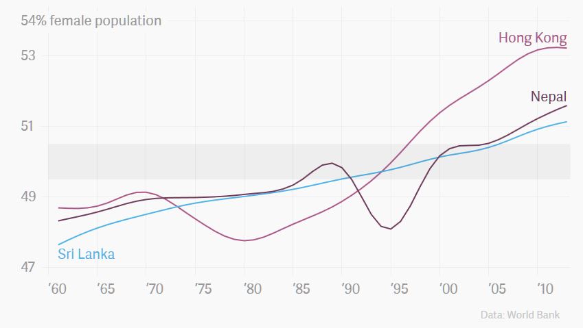
Hong Kong, Sri Lanka, and Nepal are the countries that have seen the strongest move toward a more female population over the past five decades.
The most striking development has taken place in Hong Kong over the past 35 years. The share of women in Hong Kong's population has skyrocketed from below 48% in 1980 to over 53% in 2013, from one of the lowest in the world to one of the highest. Two diverging migration patterns have led to this: emigration of mostly men to mainland China and an influx of mostly female domestic workers from the Philippines and Indonesia, leaving Hong Kong with a generation of young women struggling to find a partner.
Nepal has seen a very similar development. Starting in the mid-1990s, hundreds of thousands Nepalis, mostly men, migrated to the Arab Peninsula, Malaysia and India for work. At the same time, immigration to Nepal was predominantly female.
In Sri Lanka, the reasons for the imbalance are less conclusive. Migration, both inbound and outbound, was less skewed to men; it appears that a widening gap in life expectancy has contributed most to the general population shifting female. While in 1970, women were expected to live four years longer than men, the difference is now six. A minor role can be attributed to the civil war from 1983-2009 that left an estimated 100,000 dead.
Explore the data yourself
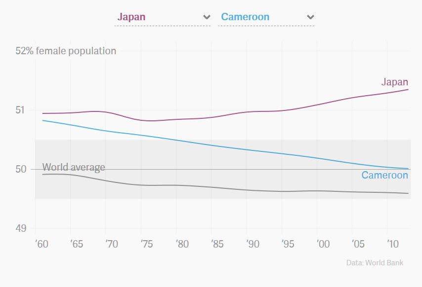
This last chart is yours. Choose two countries to compare. When you share the page, your selection is saved.
[To compare countries, click here, then scroll to Compare Chart is at end of original post.]
David Bauer is a journalist based in Basel, Switzerland. He likes to combine words, code and data. http://twitter.com/davidbauer
Built and written by David Bauer, edited by Lauren Alix Brown and David Yanofsky. Generous help from the guys at Interactive Things. Icons CC BY 3.0 by Percy Batalier and Sylvain Amatoury via the Noun Project.
Main data source: The United Nations Population Division's World Population Prospects, via World Bank (2014).


Spread the word