

It has been an exciting poll week here at Strength In Numbers. On Tuesday, we released our April Strength In Numbers/Verasight poll, which showed Trump’s approval rating at a new low of 35% and his approval on prices, Americans’ number-one issue, hitting a -46 net rating. On Wednesday, I posted a follow-up article on surprisingly high support for impeaching the president, and on Thursday, I wrote about the Democratic Party’s favorability rating. And podcast co-host David Nir and I talked about that last article in our live show at the America Votes Summit in Washington, DC!
As part of the monthly poll-update workflow, I also updated our Trump approval map and demographic tracker this week. The result is as stark a picture of dissatisfaction with Donald Trump’s presidency as we’ve seen in his second term. And no wonder, as the president hit an all-time low approval rating this week. This week’s Chart of the Week is: the incredible shrinking list of Americans who still approve of Donald Trump.
Trump is unpopular almost everywhere people actually live
Here’s the updated approval map at the PUMA level, rendered as a population cartogram so each dot is scaled to the number of people who live there. A PUMA is a “Public Use Microdata Area” — a geographic area smaller than a county that the Census Bureau puts you in as part of its work to do the decennial census. For example, the PUMA code for Strength In Numbers HQ (a shared desk in a coworking space in Alexandria, VA) is 5151255. Totally intelligible, right? Leave it to the folks at Census to develop fun geographic naming schemes.
Anyway, here’s the map. Orange is disapproval, green/teal is approval.
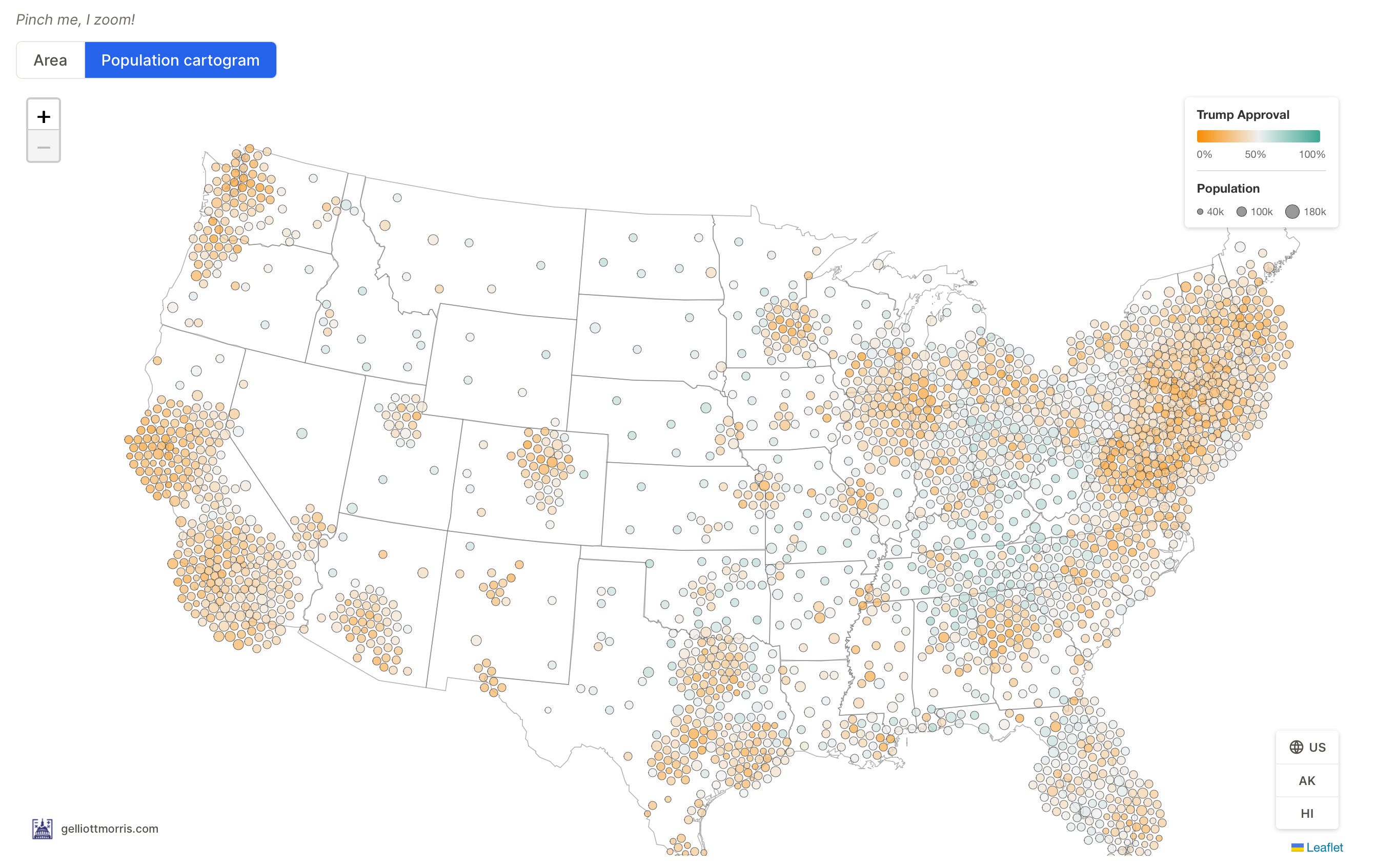
Notice that most of America is orange or white-ish green. Switch the map to geographic area (which you can do on the project website), and you’ll see plenty of teal. Much of the Mountain West, Appalachia, and Deep South look bright green in geographic terms, but few people actually live there. Since the cartogram shows opinions of people where people actually live — in cities and suburbs — the green dots tend to fade into the background.
Our tool estimates presidential approval using a statistical model that maps our polling onto demographic records from the Census, below the county level. This lets us zoom in pretty far, and things pretty much everywhere look bad for Trump. (As far as I know, nobody else is doing public public opinion modeling this detailed, so subscribe to SIN!) The model puts Trump at about 39% approval nationally, a few points higher than the 35% we got in this month’s poll because the model averages over the last year of data and moves more slowly. I’m currently building a version of this model that updates faster.[1]
Trump is above water with only two demographic groups
But the map isn’t why I’m writing this piece today. The following two graphs are. This table lists every demographic group for which Donald Trump’s approval rating is above 50%:
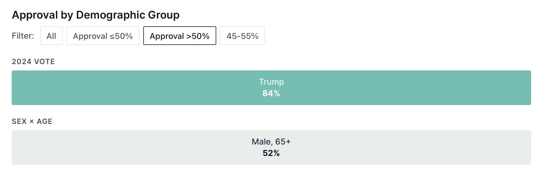
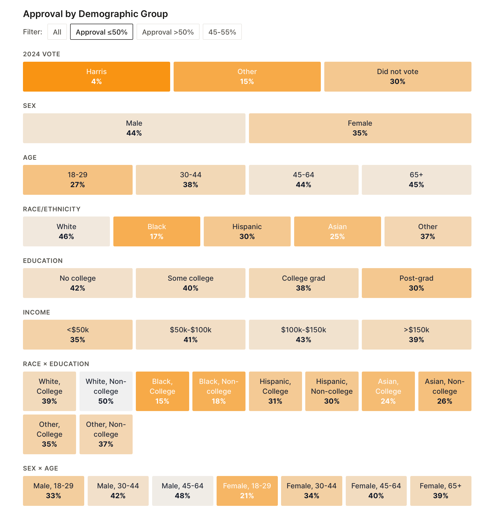
(The president rounds up to 50% with white non-college voters, but with one decimal place, it’s less than 50).
Yikes.
Even some of the groups that went strongest for Trump in 2024, like white voters without college degrees and older men, are bunched in the low-to-mid 40s. There is no group short of his own 2024 voters where Trump cracks 60% approval. The only way you get to a sub-40 approval rating is to lose a little bit, among every type of voter, everywhere.
Explore the full demographic and geographic tracker at projects.gelliottmorris.com/trump-approval, and read the April poll release here.
Strength In Numbers is a data-driven news website covering U.S. politics, elections, and public opinion. The mission here is simple: to help you be smarter about politics and the news using empirical analysis based on hard data — not speculation, conventional wisdom, or “vibes.”
Spread the word