
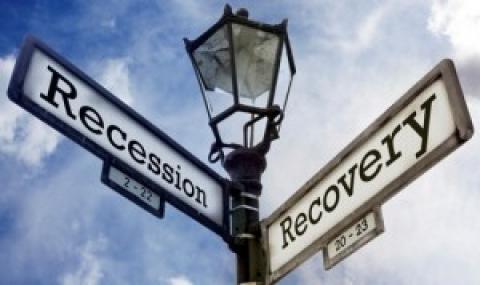
Sunday marks the five year anniversary of the day that Lehman Brothers collapsed, kicking off the devastating financial crisis that left the country with high unemployment rates, a tangled web of destruction in the housing industry, and consumer confidence that is still smarting half a decade after the fact.
It’s easy to see that the crisis has wounded the country in ways big and small, and that the damage isn’t done even now. Here are five charts that capture the scope and struggles of the Great Recession, five years after it began:
1. The sluggish recovery
The recovery has been incredibly slow compared to other economic downturns. As the Center on Budget and Policy Priorities explains with this chart, the employment is only a little bit better than keeping up with population growth. The recovery has also been largely made up of low-wage jobs, and part-time or temporary work.

2. The industries that were hardest hit
The recession didn’t come equally to all parts of the economy. Not only did African-Americans and men both experience a bigger drop in employment than the general population, but some industries — most notably the construction industry — were particularly hard-hit:

3. The government recession
While most parts of the economy are now firmly on the upswing, the same can’t be said for one group of workers: Public sector employees. Continuous budget cuts in the midst of the recession, combined with the particularly devastating across-the-board cuts precipitated by sequestration, government workers (who include teachers, firefighters, park rangers, state and local level workers, and those in Washington, DC) have been floundering. Previous recoveries have benefited from growth in the public sector, but not this time:

4. Anti-recovery budget cuts
It might seem counter-intuitive to cut government budgets during a recession, but that’s been a key platform of the Republican party. This chart from the Wall Street Journal demonstrates what the employment situation would look like without budget cuts:

5. Not out of the woods
Dodd-Frank, financial regulation law created in the wake of the recession, is meant to prevent a similarly devastating bank-driven recession from happening again. But as this chart demonstrates, Wall Street had a heavy hand in the creation of the law, participating in far more meetings than any other group.

As President Obama said on Sunday, “we’re not near where we need to be” on recovering from the Great Recession. Reasons to worry pile up. Despite rhetoric agains the “too big to fail” mentality, banks remain much too large to collapse. In fact, the largest US banks are even bigger than they were five years ago, when the recession began.
Spread the word