
Introduction
The gap in voter participation between Black and white Americans decreased following the civil rights revolution of the 1960s. Unfortunately, our research shows that for more than a decade, this trend has been reversing. This report uses data to which few previous researchers have had access to document the racial turnout gap in the 21st century.
The racial turnout gap — or the difference in the turnout rate between white and nonwhite voters — is a key way of measuring participation equality. We find that the gap has consistently grown since 2012 and is growing most quickly in parts of the country that were previously covered under Section 5 of the 1965 Voting Rights Act, which was suspended by the Supreme Court in its 2013 decision in Shelby County v. Holder. footnote1_0cgd98z1
Section 5 of the Voting Rights Act required jurisdictions with a history of racial discrimination in voting to “preclear” any changes to their voting policies and practices with the U.S. Department of Justice (or federal courts). In the Supreme Court’s Shelby County decision, Chief Justice John Roberts, writing for the majority, argued that Congress had not established that the formula used to determine the jurisdictions that would be subject to preclearance (found in Section 4b) was reflective of current political realities and that the formula was thus unconstitutional. While the Court agreed that the original coverage formula’s reliance (in part) on low turnout was justified in the 1960s and 1970s, the narrow majority concluded that contemporary turnout gaps should be used to assess current coverage under Section 4b. The Court relied heavily on turnout rates to substantiate its argument, writing that in the 2012 presidential election, “African-American voter turnout has come to exceed white voter turnout in five of the six States originally covered by §5.” But this interpretation of the data was far too narrow: the low turnout gaps in 2012 were likely due to Barack Obama’s presidential candidacy and did not demonstrate that preclearance was no longer needed. footnote2_aaxdcoe2 That moment, on its own, was unrepresentative of the general pattern showing a sustained, and now growing, racial turnout gap.
In this report, we assess how the racial turnout gap has evolved in the decade since the Court’s decision. We find that while the gap is growing virtually everywhere, Shelby County had an independent causal impact in regions that were formerly covered under Section 5. By 2022, our primary models indicate that the white–Black turnout gap in these regions was about 5 percentage points greater than it would have been if the Voting Rights Act were still in full force, and the white–nonwhite gap was about 4 points higher. Put differently: the turnout gap grew almost twice as quickly in formerly covered jurisdictions as in other parts of the country with similar demographic and socioeconomic profiles.
Recent scholarship finds that restrictive voting laws generally limit the turnout of voters of color the most. footnote3_g6dy9ec3 But while the research documents the effects of individual policies like polling place consolidation and voter identification laws, less is known about how the effects of these policies compound as more restrictions on voting are enacted. footnote4_irlcmlr4 Moreover, many policies and practices that drive voting are not codified in state law. Take, for instance, voter list maintenance practices: following the Shelby County decision, jurisdictions that previously had been required to preclear any changes to voting with the federal government dramatically increased the rate at which they removed voters, even if state laws governing list maintenance did not change. footnote5_joqwjqo5 We cannot identify and measure the impact of each individual change to voting policies and practices across the country, but the racial turnout gap necessarily takes account of all changes in voting policy, statutory or otherwise. Our unique data set, collected from nearly 1 billion vote records, allows us to conduct this analysis for the first time.
This report uses voter file snapshots from shortly after each of the past eight federal elections from Catalist and L2 to estimate turnout rates by race. Catalist and L2 are respected firms that sell voter file data to campaigns, advocacy groups, and academic institutions. Our conclusions based on this body of information about individual-level turnout behavior far surpasses what previous researchers have been able to establish working from limited survey data. We show that the racial turnout gap has grown everywhere. In all regions, the gap in the 2022 midterms was larger than in any midterm since at least 2006. In 2022, white Americans voted at higher rates than nonwhite Americans in every single state besides Hawaii. Moreover, the turnout gap cannot be entirely explained by socioeconomic differences — in income or education level — between Americans of different races and ethnicities.
That gap costs American democracy millions of ballots that go uncast by eligible voters. It also has significant consequences for political candidates and their campaigns. In 2020, if the gap had not existed, 9 million more ballots would have been cast — far more than the 7 million by which Joe Biden won the national popular vote. In 32 states, the number of “uncast” ballots due to the turnout gap was larger than the winning presidential candidate’s margin of votes. footnote6_jihqe5n6 That’s not to say that the racial turnout gap necessarily changed electoral outcomes in any given state, but the immensity of this figure does put the magnitude of the turnout gap into greater perspective. The gap matters for our political system.
Given that the racial turnout gap is growing around the country, including in regions that weren’t covered by Section 5, Shelby County’s impact is not immediately clear. The widening of the gap nationally can’t be directly attributed to the Supreme Court’s decision, though the Court perhaps emboldened jurisdictions that were not subject to preclearance to enact new restrictive policies. footnote7_jxi46sc7 However, the turnout gap — especially the white–Black turnout gap — is growing more quickly in counties that were formerly subject to Section 5 than in other, comparable parts of the country. A variety of statistical approaches support the conclusion that this more rapid growth in the turnout gap is attributable to the Supreme Court’s decision in Shelby County.
In addition, the effect of Shelby County has been growing over time; the decision did not result in a one-time increase. Instead, the difference between formerly covered and other jurisdictions was larger in 2022 than in any election since the decision was handed down. Meanwhile, with the federal government unable to protect the political rights of people of color using the full power of the Voting Rights Act, the laws and practices that would have been subject to preclearance continue to accumulate. footnote8_y35l0f78
I. Methodology
To calculate turnout rates in this report, we rely on data from the registered voter files. Current academic scholarship indicates that the voter file data from states with self-reported racial identification is superior to the data collected by the Current Population Survey, which has been used in much of the existing research on the racial turnout gap and actually understates the magnitude of the turnout gap. footnote1_l0huqzw9 Even the best political opinion surveys are often biased when it comes to self-reported turnout — some respondents falsely report that they voted, and others misremember whether they participated, leading to incorrect estimates of turnout. footnote2_nofhbbs10
Voter files, on the other hand, are government administrative records of who participated and are free of response or sampling bias. While other academic surveys like the Cooperative Election Study have begun validating respondents’ reported turnout history in recent years, the voter files offer an unparalleled look at the U.S. electorate. footnote3_xstlpfb11
Voter File Data
All told, we analyze nearly 1 billion voter file records. footnote4_gzrgytc12 This study is, to the best of our knowledge, the first to use such a large set of registered voter files to estimate turnout rates. Specifically, we analyze snapshots of the registered voter file from every state from the past eight federal elections. Each snapshot includes a record of every voter registered in the state at that time. These snapshots were each collected shortly after the election in question, offering an accurate picture of participants in each of the elections. footnote5_6uqof8m13 For the 2008–2012 elections, we rely on snapshots provided by Catalist; for the 2014–2022 elections, we use records from L2. There is no reason that obtaining data from different vendors would impact any results we present in the body of this report. One potential concern could arise from different racial predictions from the vendors, but in no case do we rely on proprietary racial categorization. Instead, in all years and from both vendors, we rely solely on either self-reported racial data or on consistent, open-source methodologies discussed below. footnote6_nauo3hk14
We refrain from analyzing registration rates calculated from the voter files. Such files contain some amount of deadwood — that is, voters who are registered but no longer eligible to vote (perhaps because they have moved or passed away). If racial groups have different levels of deadwood, we would have biased registration rates. Moreover, states conduct voter list maintenance (the removal of ineligible voters) at different times. Comparing the total number of registrants in two states in the spring of an odd-numbered year might be less an indication of underlying registration rates than of the timing of this routine administrative list maintenance. Neither of these issues is likely to impact turnout rates estimated from the voter file. These records indicate whether each person actually cast a ballot. What’s more, voters who participate in an election are unlikely to be removed from the rolls as part of systematic voter list maintenance the following spring, when our snapshots were collected: states generally remove individuals due to nonparticipation. footnote7_0kuo7j415
Voters’ Race and Racial Turnout Rates
Most states do not include self-reported racial identification in their voter files. footnote8_b863wpw16 For these states, we use Bayesian Improved Surname Geocoding (BISG), an approach that incorporates two different data sources to predict each voter’s race. footnote9_y6khg4u17 The first is the racial composition of a voter’s neighborhood, in this case census block groups. The second is the racial distribution of surnames from the Census Bureau. Every 10 years, the Census Bureau publishes data on the racial identifications of Americans with different surnames. For instance, in the 2010 census, 92 percent of respondents with the last name Martinez identified as Latino, and 89 percent of respondents with the last name Wood identified as white. Using both data sources, BISG estimates the likelihood that a voter is Black, white, Latino, Asian, or “some other race.” footnote10_o4luzfr18 BISG is widely used among academic researchers and has been accepted by courts as a valid basis for evaluating a number of concepts, including the presence of racially polarized voting. footnote11_zltc1wu19
Throughout this report, we slightly modify the canonical version of BISG, which uses the racial characteristics of the total population (from the decennial census) of a voter’s block group. footnote12_paobnhg20 We use geographic population characteristics to estimate the characteristics of voters; thus, the more similar the geographic population we use is to the pool of registered voters, the better we can predict race. The total population can skew estimates where it is different from the citizen voting-age population (CVAP) — for instance, in areas with large noncitizen immigrant populations. We therefore use the CVAP from the five-year American Community Survey (ACS) estimate ending with each election year as our target population for the BISG analyses. In the technical appendix accompanying this report, we show that using CVAP results in better estimates (in states with self-reported race) and that our primary results hold when using total or total adult population.
We calculate turnout rates by dividing the number of ballots cast by members of each racial group by the CVAP from the ACS five-year estimates ending in each election year. footnote13_tifa4ax21 The Census Bureau publishes CVAP at the block-group level, a low geographic level that roughly corresponds to neighborhoods. (The median block group had a population of 1,248 in 2021.) footnote14_6z15rw522 In conjunction with the geocoded voter file, we produce detailed turnout estimates for very low geographic units across the nation. footnote15_p6205u423 We also aggregate up to higher geographic levels like counties and states.
Calculating turnout as the share of citizens of voting age in each racial group who participate — and not as the share of registered voters in each group — follows the definition provided by Bernard Fraga in his book, The Turnout Gap. footnote16_0uzpsqj24 We calculate the turnout gap in the same way, by subtracting the turnout rate of each group from the turnout rate of white Americans.
Adjusting the Turnout Gap
In addition to looking at the raw turnout gap, we also present results weighting the gap by the nonwhite share of the population in each state. This lets us determine how much higher overall turnout would have been had nonwhite voters participated at the same rate as white voters and compare the gap’s impact on statewide turnout across states with different racial characteristics. Such estimates rely on two measures. The first is the size of the racial turnout gap. The greater the distance between white and nonwhite turnout, the higher the weighted turnout gap. The second is the relative size of the nonwhite population in a given jurisdiction. Those where the population is less white will have a higher weighted turnout gap. Weighting the turnout gap allows us to compare the impact of the gap on statewide turnout in different sorts of states.
We do not mean to imply that large racial turnout gaps do not matter where minority populations are small. For example, Native American turnout rates are lower than those of other groups, a result of centuries of racially discriminatory policymaking. footnote17_gajknnq25 However, the Native American population in most states is not large enough to depress overall statewide turnout. Different measures are clearly needed to capture the participatory implications of large turnout gaps on small populations. Despite this limitation, however, weighting the turnout gap offers a way of identifying the states where racial turnout gaps are meaningfully depressing overall turnout numbers.
We weight a jurisdiction’s turnout gap by estimating the jurisdiction’s racial turnout gap and multiplying it by the nonwhite share of the population. Consider, for example, a hypothetical state where white turnout is 60 percent, nonwhite turnout is 50 percent, and 20 percent of the CVAP is nonwhite. The turnout gap is 10 percentage points (60 percent – 50 percent), and the weighted gap is 2 percentage points (10 percentage point turnout gap × 20 percent nonwhite population share). In other words, statewide turnout in this state would have been 2 percentage points higher in the absence of the turnout gap.
II. Participation Rate Differences Across Time
In the analyses that follow, we examine how turnout rates and gaps have evolved since 2008. Data of this kind is not available prior to 2008, making that the earliest year for which voter file snapshots can be used on a nationwide scale. While the Obama presidency probably reduced racial turnout gaps early in our study period, our results indicate that the gap has widened ever since 2014, when a nonwhite presidential candidate was not temporarily reducing these disparities.
General Turnout Gap
Figure 1 plots the national turnout rates among Asian, Black, Latino, and white voters — the ethnic/racial groups for which BISG provides reliable estimates. As figure 1 makes clear, turnout for white and Black voters in the 2008 and 2012 elections, with Obama at the top of the ticket, reached near parity. While turnout rates for Asian and Latino voters lagged white and Black voters, the overall white–nonwhite turnout gap was narrower during these years than in the decade that followed.
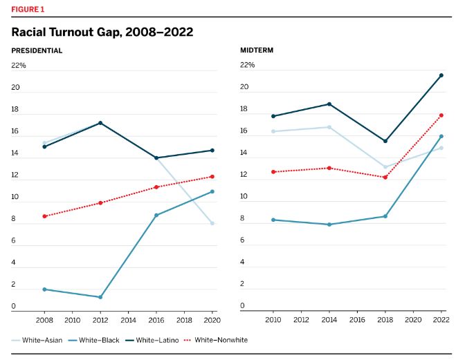
As we discussed above, the majority of the Court in Shelby County pointed to the narrow turnout gaps in the 2008 and 2012 presidential elections to argue against the continued necessity of Section 5 of the Voting Rights Act. Of course, political science research has long established that Black voters participate at higher rates when Black candidates are on the ballot; this, as much as anything else, was the likely explanation for the near parity in those years. footnote1_xughlni26 Figure 1 makes clear just how narrow the Court’s argument was. In the 2010 election, when Section 5 was still in full force, the white–Black turnout gap was 8 percentage points — four times the size of the gap in 2008. By pointing only to presidential elections with a Black candidate, it focused on elections where factors unrelated to voting rights (temporarily) reduced the racial turnout gap.
While turnout rates have collectively improved since 2012, white turnout has increased the most: from the 2012 to 2020 presidential elections, white turnout rose by 10 percentage points while overall nonwhite turnout went up by less than 8 points. Similarly, from the 2014 to 2022 midterm elections, white turnout rose by 13 points while nonwhite turnout increased by only 8 points. Much of the increase in the gap was concentrated in 2022, perhaps due to the highly contentious round of redistricting leading into that year’s election. All told, the white–nonwhite turnout gap increased from 10 points to 12 points between 2012 and 2020.
The shifts in national turnout rates among different racial groups raise many questions. Black voters, for instance, are generally concentrated in the Northeast and the South, while Latino and Asian communities are larger on the West Coast. Are the differences in racial turnout rates just regional differences? Are voters on the West Coast less likely to participate overall, regardless of their race? Figures 2 and 3 plot the turnout rates for each racial group within each of the country’s broadly defined regions: Northeast, South, Midwest, and West. footnote2_j6mc18727
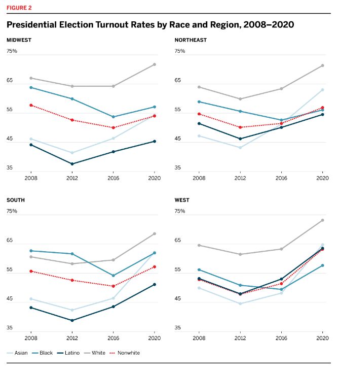
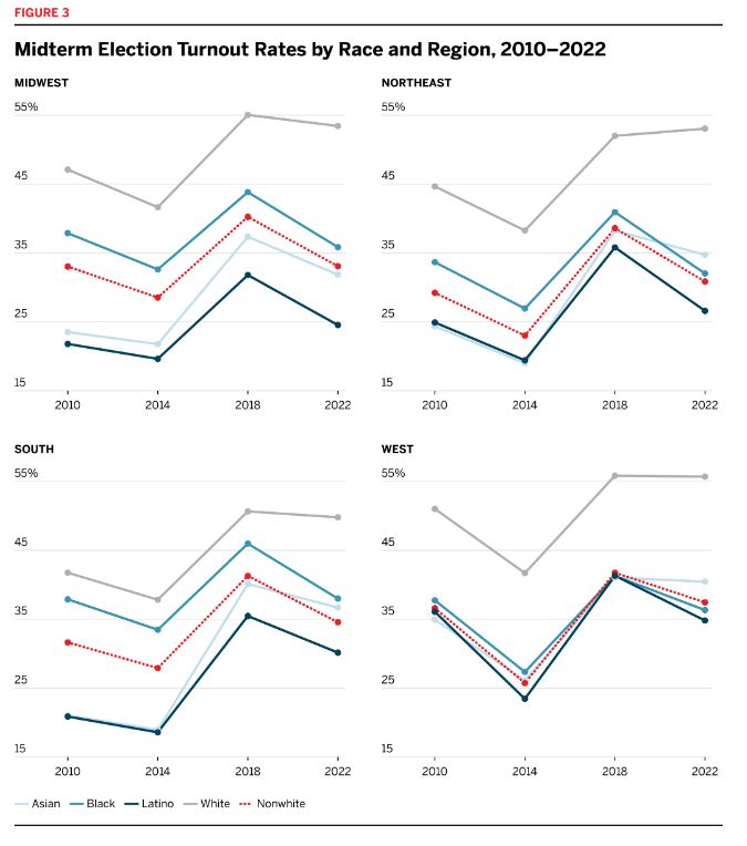
Figures 2 and 3 make clear that most of the racial turnout gap is not explained by regional differences. Within each region, white turnout exceeded that of other groups in every year apart from the 2008 and 2012 elections in the South, where Black turnout slightly exceeded white turnout. footnote3_mysb0wn28
Americans with less education, less money, and fewer resources are less likely to participate in elections. footnote4_c0ydkkf29 The opportunity cost of participating can be higher for Americans with fewer resources. footnote5_bb28d5330 Traveling to a polling place, for instance, is harder for people without access to a car; the time cost might be compounded for an individual required to take unpaid time off work to vote. Further, individuals juggling multiple jobs or child-care responsibilities, or who face other demands on their time, might forget to register to vote prior to the deadline. Policies that make it more difficult to vote fall hardest on the people with the fewest resources to dedicate to voting.
Economically disadvantaged voters might also abstain from participating because of alienation from government and a political system that in many ways fails to reflect their policy preferences. footnote6_a1ljnj731 Regressive policies, such as campaign finance rules that favor wealthy donors and corporate entities or aggressive partisan gerrymandering, send messages to voters that politicians do not care about their needs. As Soss and Jacobs observe, policies that do not address voters’ pressing challenges can “foster atomized publics with little sense of what they have in common and at stake in politics and government.” footnote7_duyndc032 The same is true when voters think of the government as something that happens to, and not with, them. In some communities, for example, a constant and aggressive police presence teaches citizens that government is something imposed on them, not something that they can control. footnote8_9ueww8k33
As a result of centuries of racially discriminatory policymaking, including when only white people were permitted by law to vote or make policy, racial and ethnic minorities are over-represented in populations where economic and other social precarities are common. footnote9_cbkj52934 Given that social disadvantages can undermine democratic participation, do socioeconomic factors explain the racial turnout gap? They do explain some of it: turnout in the bottom income quartile in 2022 was 32 percent, compared with 58 percent in the top income quartile. The bottom quartile was also considerably less white (the CVAP was 53 percent white compared with 72 percent white in the top quartile). But we find that there are turnout gaps between racial groups living in socioeconomically similar neighborhoods, which indicates that these characteristics can’t entirely explain such gaps.
While the voter file does not include information about voters’ economic status or education, ACS five-year estimates from the Census Bureau reveal the income and education characteristics of the neighborhoods in which they live. We break out turnout gaps by census tract in figures 4 and 5 to test whether neighborhood characteristics influence turnout. footnote10_xrgtiki35 We first plot the turnout gap for different races in neighborhoods based on the median household income, with the first quartile being the lowest-income neighborhoods and the fourth quartile being the highest.
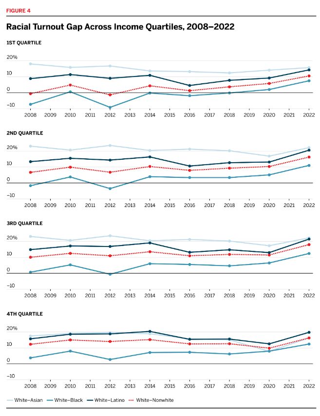
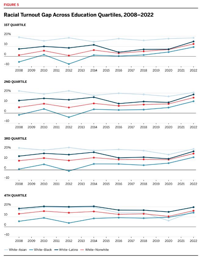
Figure 4 makes immediately clear that the turnout gap is not driven simply by the fact that voters of color live in lower-income neighborhoods: a persistent turnout gap has grown steadily in each income quartile over the past decade. Outside the highest-income areas, the white–Black turnout gap closed prior to 2014, though it has subsequently grown. While white–nonwhite turnout rates approached parity in the early parts of the past decade among voters living in low-income neighborhoods, the same is not true in high-income neighborhoods, which have consistently had the largest turnout gaps. The white–nonwhite turnout gap exceeded 15 percentage points in 2022’s midterm election among voters living in the highest-income parts of the country. footnote11_ln3x7qd36
The trends in the white–Asian turnout gap, broken out by income, tell a different story. As figure 1 shows, the overall white–Asian turnout gap narrowed from 14 points in 2016 to just 8 points in 2020. Figure 4 shows, however, that increased participation rates were largely concentrated among Asian voters living in high-income neighborhoods. For Asian Americans living in the lowest-income neighborhoods, the gap grew between 2016 and 2020.
Neighborhood estimates of education level similarly cannot fully explain the turnout gap, as seen in figure 5. When we split tracts into quartiles based on the proportion of the adult population that has at least a bachelor’s degree, turnout gaps remain for all groups. Similar to the trends across income level, the white–nonwhite turnout gap is largest among voters living in the highest-educated neighborhoods. And, while the gaps may be smaller in lower-education neighborhoods, those are also the neighborhoods where the gap is growing most rapidly. Further, reductions in the white–Asian turnout gap are almost entirely concentrated among voters in the highest-educated neighborhoods. While the white–Asian gap is substantially larger than that of other racial and ethnic groups among voters living in all but the most educated areas, it has consistently been close to or smaller than the white–Latino gap in high-education neighborhoods.
Weighted Turnout Gaps
Figure 6 shows how the turnout gap impacted statewide turnout in the 2020 presidential (left-hand panel) and 2022 midterm (right-hand panel) elections. We break states out according to whether they were entirely, partially, or not covered by the preclearance condition of the Voting Rights Act prior to Shelby County. Nationally, turnout would have been 4 percentage points higher in 2020 and 6 percentage points higher in 2022 if nonwhite voters had participated at the same rate as white voters. These figures are particularly striking considering that turnout in these elections was at near-record highs; in fact, turnout in 2020 was the highest in at least a century. And yet, had voters of color participated at the same rates as white voters in 2020, 9.3 million more ballots would have been cast, and in 2022 that figure would have been 13.9 million. White turnout exceeded nonwhite turnout in every single state except Hawaii in 2022.
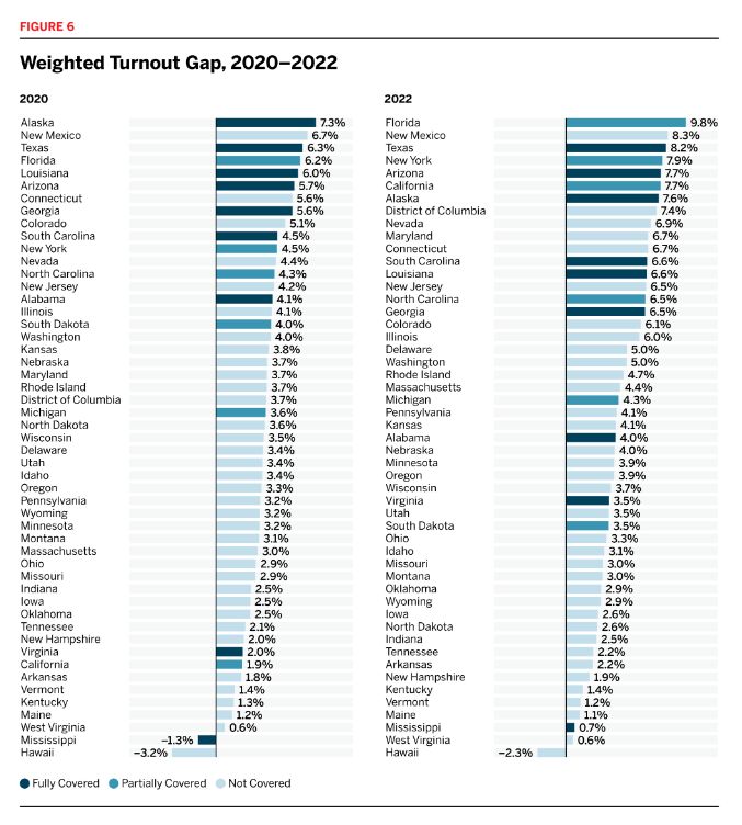
Figure 6 indicates that the weighted turnout gap was not uniformly distributed across states. It was largest in Alaska in 2020 and Florida in 2022. New Mexico and Texas had the second- and third-largest gap in both elections. These states are home to large nonwhite populations, so their presence at the top is unsurprising given that the relative size of the nonwhite population directly contributes to the influence of the racial turnout gap on overall participation rates. Another striking feature of this figure, however, is the concentration of high weighted gaps in states in the West; generally speaking, the impact of the racial turnout gap on statewide turnout was larger in states where Latinos make up a large share of the nonwhite population. This corresponds with results presented in the previous section: although Latino turnout rates were not markedly different in different regions, Latinos make up a larger share of the population in the West, exerting a larger influence on statewide turnout in those states.
Figure 6 also makes clear just how distinct the states formerly covered by Section 5 of the Voting Rights Act remain. The formerly covered states have large nonwhite populations and large turnout gaps, leading to some of the largest statewide turnout distortions in the nation. Put differently, a decade after Shelby County, the turnout gap continues to have a disproportionate impact in precisely the parts of the country that were once covered due to their histories of racially discriminatory voting practices.
Figures 7 and 8 break down the weighted turnout gaps in 2020 and 2022, respectively, based on which group formed the largest nonwhite racial or ethnic group in the state. The weighted gap is consistently highest in states where Latinos were the largest nonwhite group. Once again, the impact of the racial turnout gap on statewide participation rates is highest in the parts of the country that were covered under Section 5 of the Voting Rights Act. (In these charts, “other” includes all states where a group other than Black or Latino Americans is the single largest nonwhite group.)
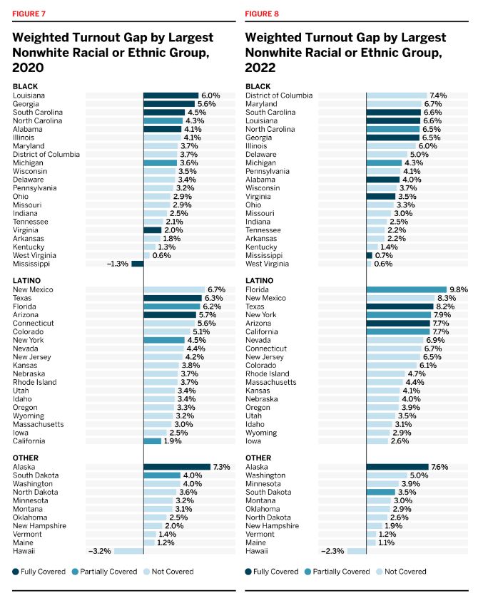
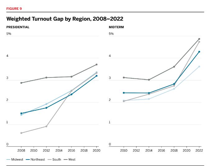
Figure 9 shows how the weighted gap has evolved over the past 15 years. We break the trends out into four major regions. The figure indicates that the weighted gap has grown nearly everywhere, just as the raw racial turnout gap has. By way of reminder, the growth in the weighted gap is driven both by changes in the turnout gap and by changes in the nonwhite share of the population; if the turnout rate is constant but the nonwhite share of the population grows, the effect of the turnout gap on statewide turnout increases.
III. The Effects of Shelby County v. Holder
See the academic working paper for a more in-depth discussion of the theory, methods, and results included in this section.
Prior to 2013, states and localities with a history of racial discrimination in their voting practices were required to clear any changes to their electoral policies before they could go into effect. Over the past decade, since the Supreme Court suspended preclearance, nearly 30 laws that make voting more difficult have gone into effect in states formerly covered under Section 5. footnote1_ib7d7ss37
These formal changes in laws may be just the tip of the iceberg. County-level administrators have a great amount of discretion over how elections are run, deciding such things as the movement or even closure of polling places. footnote2_3l96a9g38 Such discretionary modifications are not reflected in changes to statewide voting law, but they would have been subject to preclearance in covered jurisdictions prior to the Shelby County decision.
Because jurisdictions are no longer required to report and submit these changes to the federal government for analysis of their potentially discriminatory effects, researchers have struggled to assess the total impact this Supreme Court decision has had on voters of color. By evaluating the decision’s effects on the racial turnout gap, we are able to provide at least one measure that necessarily takes account of all changes in voting, whether statutory or otherwise. Our unique data set allows us to conduct this analysis for the first time.
As we showed in the previous sections, places formerly covered by Section 5 had the highest weighted turnout gaps in 2020 and 2022. But that doesn’t necessarily prove that the elimination of the preclearance regime caused the gaps in these places to grow; it’s possible that these places already had higher than average turnout gaps prior to 2013, for instance, or that the gaps in places with large Black populations would have increased the most over the past decade even if the preclearance system had continued.
To test the effect of the Shelby County decision more directly, we calculate the white–nonwhite and white–Black turnout gap for every county in the country for each election between 2008 and 2022. footnote3_j8t980s39 But the counties formerly covered by Section 5 differed socioeconomically in important ways from the rest of the country. footnote4_oaptksi40 They were, for instance, on average 16.7 percent Black, compared with just 3.4 percent for non-covered counties. Covered counties voted for Barack Obama at higher rates, and were also younger, than uncovered counties. Because of these differences, we might expect the turnout gap to evolve in formerly covered counties in the post–Shelby County period in distinct ways from the rest of the country. Take, for instance, the Black share of the population. Given our expectation that Obama’s candidacy reduced the white–Black turnout gap, we would expect the turnout gap to grow the most quickly in the post-Obama era in areas with large Black populations. Put differently, there might have been forces other than Shelby County disproportionately increasing the turnout gap in formerly covered jurisdictions.
To account for the differences between covered and non-covered counties, we use a tool called entropy balancing. This lets us weight the counties that were not covered so that they resemble the covered ones, based on 2012 (that is, pre-Shelby County) characteristics. For a much more detailed discussion of our methodology, a balance table, and various robustness checks, see the appendix.
Figure 10 plots the trends in the white–Black turnout gap over time for counties covered under Section 5 and the (weighted) ones that were not. The white–Black gap before Shelby County was more than 3 points higher in covered counties than in counties that were not covered. By way of reminder, the Supreme Court wrote in Shelby County that the turnout gaps in formerly covered jurisdictions appeared to be in line with the rest of the country. While there was some truth to that point, it ignored the important socioeconomic differences between this region and the rest of the country. Figure 10 indicates that — after accounting for these differences — conditions in Section 5 jurisdictions were considerably worse than in the rest of the country even before Shelby County.
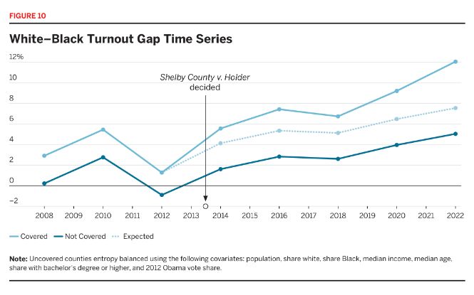
While the figure visually indicates that the turnout gaps might have grown more in places formerly covered by Section 5 than in others, Shelby County is clearly not the sole driver of the increasing turnout disparities. That’s not necessarily surprising: as discussed above, new restrictive voting laws have gone into effect all around the country over the past decade, not only in formerly covered states, and this could be responsible for some of the upward trends in the gap.
However, the Supreme Court decision could be exacerbating underlying trends. To test this possibility, we use a “difference-in-differences” design. footnote5_rxrqham41 We begin from the assumption that the turnout gaps in covered and non-covered counties would have evolved in parallel if the Court hadn’t invalidated Section 4b, net of controlling for other relevant characteristics. The plausibility of this assumption is bolstered by the fact that, as figure 10 shows, the gaps went up and down in virtual lockstep prior to 2013. This doesn’t mean that the gaps in the two sets of counties would have been the same; as figure 10 makes clear, the formerly covered counties had higher gaps even prior to Shelby County (once we weighted the other counties appropriately). If the post–Shelby County differences between covered and non-covered counties increased to a great enough extent, we could conclude that Shelby County had a causal impact on the turnout gap.
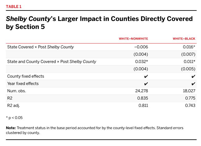
Our statistical models (which include county and year fixed effects) indicate that Shelby County caused a statistically significant increase in both the white–Black and the white–nonwhite turnout gaps. In the non-covered counties, the white–nonwhite and white–Black turnout gaps grew by 5 and 6 percentage points between 2012 and 2022, respectively; in the covered counties, however, the comparable figures were 9 and 11 points, respectively. In other words, by 2022, the white–nonwhite turnout gap grew about 4 points larger and the white–Black gap 5 points larger in the formerly covered counties than they would have if Shelby County hadn’t been handed down. They grew at a substantially quicker pace than similar, non-covered counties. Over the post-treatment period as a whole, the average treatment effect on the treated counties was about 2 points, which is statistically significant at the 99 percent confidence level.
In addition to these overall effects, we also conclude that the effects of Shelby County were largest in exactly the sorts of counties we would expect. We start from the observation that Shelby County could have had different effects in different sorts of counties. Many counties were fully covered under Section 5 of the Voting Rights Act; any changes to their local election practices needed to be precleared by the federal government. There were, however, other counties that were not covered by Section 5, but where the decision might still have had an impact: non-covered counties in states that were partially covered by Section 5. That’s because the Supreme Court ruled in Monterey County v. Lopez that all statewide voting policies were subject to review if even a single county in the state was covered by Section 5. footnote6_i1iiq7942 In Florida, for instance, only five counties were formally covered by preclearance. Nevertheless, Section 5 blocked the state’s 2002 House district maps. These uncovered counties in partially covered states could therefore make local decisions without getting preclearance from the federal government, but state policies impacting the administration of elections in these counties were subject to such approval. Because Shelby County didn’t impact these uncovered counties as much, we would expect the decision to have a muted effect in these places.
Table 1 indicates that the effect of Shelby County was indeed muted in counties that were not covered by Section 5 but were in partially covered states. In fact, the coefficients on State Covered × Post Shelby County are not statistically significant in the white–nonwhite gap model. We do, however, find that Shelby County meaningfully increased the turnout gaps in counties where both state and local practices were subject to preclearance.
Our second extension deals with Section 5 objection letters from the years prior to Shelby County. Before Section 4b was invalidated, localities would receive an “objection letter” from the federal government if a proposed change was not cleared under the preclearance condition. Put differently, these objection letters identified policies with racially disparate impacts and stopped them from going into effect. We would expect that Shelby County would have a larger effect in counties that tried to enact a racially regressive policy in the years when they were still covered under Section 5 of the Voting Rights Act. To avoid the possibility that objection letters are simply identifying the counties that were directly covered by Section 5, we do not include the uncovered counties in partially covered states in this analysis (these counties did not need to preclear changes and thus would not have received objection letters).
Table 2 indicates that this was the case. Shelby County did increase the white–nonwhite turnout gap even in counties without an objection letter. But the gaps went up considerably more in the counties that did have an objection letter: by an additional 1.8 points (for the white–Black gap) and 1.6 points (for the white–nonwhite gap).
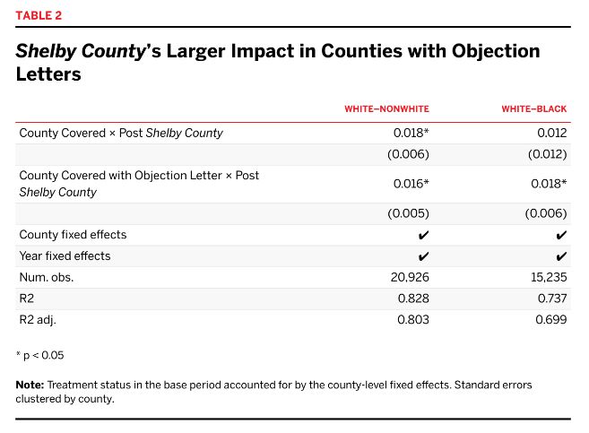
That the causal effect of Shelby County on the white–nonwhite turnout gap is significant only in the fully covered counties, and not in the uncovered counties in partially covered states, underscores the importance of local election administration for participation rates. So too does our finding that the gap increase was concentrated in counties that tried to implement discriminatory changes under Section 5. County-level coverage, not constraints on statewide policy, appear to have been the drivers of post-Shelby County turnout gap increases.
In the appendix, we show that the finding that Shelby County increased the turnout gaps is robust to many robustness checks.
Conclusion
If the United States wants to make good on its foundational claims of a democratic system of governance open to all citizens, it must find ways to close the racial turnout gap. Wider now than at any point in at least the past 16 years, the gap costs millions of votes from Americans of color all around the country. Perhaps most worrisome of all, the gap is growing most quickly in parts of the country that were previously covered under the preclearance regime of the 1965 Voting Rights Act until the disastrous Shelby County ruling.
This report gives us a better look at the contours of the racial turnout gap than ever before and throws the severity of the problem into stark relief. We urge scholars to continue to study the myriad drivers of the turnout gap, from statewide policies to local election practices, from language barriers to disaffection from the criminal justice system; without a full understanding of the causes, we cannot develop solutions that will permanently ensure political representation for Americans of all races.
Importantly, as we’ve shown, socioeconomics can’t fully explain the gap; the gap remains in high- and low-income neighborhoods alike. We do, however, prove one of the causes of the increasing racial turnout gap: the Supreme Court’s ruling in Shelby County. There is no doubt that the end of federal preclearance in regions with histories of racial discrimination increased the racial turnout gap. We argue that this is due to changes both in state policy and in local election practices. A fully functional Section 5 of the Voting Rights Act would improve conditions in areas where racial discrimination remains in voting policy. We urge Congress to pass the John R. Lewis Voting Rights Advancement Act to update and restore the preclearance regime for the 21st century.
Endnotes
- footnote1_0cgd98z
1
Shelby County v. Holder, 570 U.S. 529 (2013).
- footnote2_aaxdcoe
2
Lawrence Bobo and Franklin D. Gilliam, “Race, Sociopolitical Participation, and Black Empowerment,” American Political Science Review 84, no. 2 (1990): 377–93, https://doi.org/10.2307/1963525; and Ebonya Washington, “How Black Candidates Affect Voter Turnout,” Quarterly Journal of Economics 121, no. 3 (2006): 973–98, https://doi.org/10.1162/qjec.121.3.973.
- footnote3_g6dy9ec
3
Anna Baringer, Michael C. Herron, and Daniel A. Smith, “Voting by Mail and Ballot Rejection: Lessons from Florida for Elections in the Age of the Coronavirus,” Election Law Journal: Rules, Politics, and Policy 19, no. 3 (2020): 289–320, https://doi.org/10.1089/elj.2020.0658; Bernard L. Fraga and Michael G. Miller, “Who Do Voter ID Laws
Keep from Voting?,” Journal of Politics 84, no. 2 (2022): 1091–1105, https://doi.org/10.1086/716282; John Kuk, Zoltan Hajnal, and Nazita Lajevardi, “A Disproportionate Burden: Strict Voter Identification Laws and Minority Turnout,” Politics, Groups, and Identities 10, no. 1 (2022): 126–34, https://doi.org/10.1080/21565503.2020.1773280; and Enrijeta Shino, Mara Suttmann-Lea, and Daniel A. Smith, “Determinants of Rejected Mail Ballots in Georgia’s 2018 General Election,” Political Research Quarterly 75, no. 1 (2022): 231–43, https://doi.org/10.1177/1065912921993537. - footnote4_irlcmlr
4
Kevin Morris and Peter Miller, “Authority After the Tempest: Hurricane Michael and the 2018 Elections,” Journal of Politics 85, no. 2 (2023): 405–20, https://doi.org/10.1086/722772; and Fraga and Miller, “Who Do Voter ID Laws Keep from Voting?”
- footnote5_joqwjqo
5
Jonathan Brater et al., Purges: A Growing Threat to the Right to Vote, Brennan Center for Justice, 2018, https://www.brennancenter.org/our-work/research-reports/purges-growing-threat-right-vote.
- footnote6_jihqe5n
6
David Wasserman et al., “2020 Popular Vote Tracker,” Cook Political Report, 2020, https://www.cookpolitical.com/2020-national-popular-vote-tracker.
- footnote7_jxi46sc
7
Further, by putting the burden on advocates to monitor changes in policy and bring Section 2 cases in all 50 states, the decision made it more likely that a change in a non-covered jurisdiction would go unnoticed or unchallenged. Section 2 prohibits any electoral practice that minimizes the voting strength of a racial or ethnic group.
- footnote8_y35l0f7
8
J. Morgan Kousser and others have documented the central role that the federal government must play in promoting and safeguarding multiracial democracy in the United States. See J. Morgan Kousser,
Colorblind Injustice: Minority Voting Rights and the Undoing of the Second Reconstruction (Chapel Hill, NC: University of North Carolina Press, 2000), https://uncpress.org/book/9780807847381/colorblind-injustice; and Jacob Grumbach, Laboratories Against Democracy: How National Parties Transformed State Politics (Princeton, NJ: Princeton University Press, 2022), https://doi.org/10.2307/j.ctv2hbr28q. - footnote1_l0huqzw
9
Stephen Ansolabehere, Bernard L. Fraga, and Brian F. Schaffner, “The Current Population Survey Voting and Registration Supplement Overstates Minority Turnout,” Journal of Politics 84, no. 3 (2022): 1850–55, https://doi.org/10.1086/717260.
- footnote2_nofhbbs
10
Ted Enamorado and Kosuke Imai, “Validating Self-Reported Turnout by Linking Public Opinion Surveys with Administrative Records,” Public Opinion Quarterly 83, no. 4 (2019): 723–48, https://doi.org/10.1093/poq/nfz051.
- footnote3_xstlpfb
11
These voter files do not indicate for whom someone voted; ballots are secret in the United States. Instead, they indicate whether someone voted and, in some states and years, how the ballot was cast (in person or via the mail).
- footnote4_gzrgytc
12
The snapshots we leverage collectively have 1.5 billion records; this report, however, looks only at the individuals who voted in a particular federal general election.
- footnote5_6uqof8m
13
In the technical appendix accompanying this report, we report the date of each snapshot. Though the voter files are the best available data, they are not perfect. Voter files are constantly in flux. For instance, it can take states a handful of months to record participation in the registered voter file. Moreover, states are constantly “cleaning” their voter files and removing ineligible voters. By the time a complete set of participants is included in the file, other voters may have died, moved away, or been removed from the file for another reason. Thus no 100 percent accurate voter file exists that captures all participants and includes all individuals registered as of a given election. See Seo-young Silvia Kim and Bernard Fraga, “When Do Voter Files Accurately Measure Turnout? How Transitory Voter File Snapshots Impact Research and Representation,” American Political Science Association, APSA Preprints, Version 1, September 14, 2022, https://doi.org/10.33774/apsa-2022-qr0gd.
- footnote6_nauo3hk
14
In many states, voters’ state identification numbers are reported by both Catalist and L2. Using the state ID number, along with voters’ house number and ZIP code, we identify 94 million voters who did not move between the 2012 and 2014 elections. The correlation coefficients (an estimate of the “fit” of these data sets) on the predicted probability of being white, nonwhite, Black, or Latino are all 0.97 (it is 0.93 for probability of being Asian). Given that voters’ racial estimates are updated each year as the racial composition of the citizen voting-age population in an assigned block group changes, we would expect a correlation coefficient approaching, but not exactly, 1. As such, we conclude that the files are highly comparable and that combining these files improves the power of our analyses and does not bias our results. In addition, the parallel trends assumption (that is, that the turnout gaps in covered and non-covered counties would have evolved in parallel if the Court hadn’t invalidated Section 4b) means that changing data vendors does not bias our causal estimates of the effect of Shelby County on the turnout gap, so long as differences between vendors are unrelated to coverage status. Among this set of voters, the average change in the predicted probability of being white decreased by 0.5 percentage points for voters in covered and uncovered states alike between 2012 and 2014, indicating that our results are not being driven by the crossover from Catalist to L2 in 2014.
- footnote7_0kuo7j4
15
According to the National Voter Registration Act, voters can be removed from the rolls only under specific circumstances if the state doesn’t have personalized information indicating a change in eligibility. Generally, voters must fail to respond to a postcard and fail to participate in two federal election cycles before they can be removed. Thus, many individuals removed after a given election will be those who did not vote. For a detailed discussion of how list maintenance impacts voter file data, see Kim and Fraga, “When Do Voter Files Accurately Measure Turnout?”
- footnote8_b863wpw
16
The exceptions are Alabama, Florida, Georgia, Louisiana, North Carolina, and South Carolina.
- footnote9_y6khg4u
17
Kosuke Imai and Kabir Khanna, “Improving Ecological Inference by Predicting Individual Ethnicity from Voter Registration Records,” Political Analysis 24, no. 2 (2016): 263–72, https://doi.org/10.1093/pan/mpw001.
- footnote10_o4luzfr
18
Following BISG’s categorization, we consider Latino or Hispanic voters to be nonwhite in all cases. Throughout our analyses, we aggregate up the posterior probabilities rather than assigning voters a discrete race. Thus, if we had 10 voters who were each predicted to be Black with 40 percent certainty and white with 60 percent certainty, we would assume (in aggregate) that we had four Black and six white voters. Discrete assignment would assume that we had 10 white voters, the most likely racial category for each of them. It is worth noting that the surname data provided by the Census Bureau and incorporated into the BISG algorithm does not report whether an individual is “some other race.” Instead, the developers of the BISG algorithm combine the “Non-Hispanic American Indian and Alaska Native Alone” and “Non-Hispanic Two or More Races” to create the “some other race” category. Because the “other” category returned by BISG does not correspond exactly to “other” as defined in, e.g., the Census Bureau’s CVAP data, at no point do we present turnout estimates of the “other” category. Wherever we present the overall nonwhite turnout rates (or the white–nonwhite gap), “nonwhite” is calculated by subtracting the estimated number of white ballots (or CVAP) from the total number of ballots (CVAP), thus sidestepping this issue.
- footnote11_zltc1wu
19
Christian R. Grose, Expert Report of Christian R. Grose, Ph.D., La Union Del Pueblo Entero et al. v. Gregory w. Abbott et al., No. 5:21-CV-0844-XR (W.D. Tex 2022); Loren Collingwood, Expert Report of Loren Collingwood, Ph.D., LULAC Texas et al. v. John Scott et al., No. 1:21-cv-786-XR (W.D. Tex 2022); Jacob M. Grumbach and Alexander Sahn, “Race and Representation in Campaign Finance,” American Political Science Review 114, no. 1 (2020): 206–21, https://doi.org/10.1017/s0003055419000637; and Kevin DeLuca and John A. Curiel, “Validating the Applicability of Bayesian Inference with Surname and Geocoding to Congressional Redistricting,” Political Analysis 31, no. 3 (2023): 465–71, https://doi.org/10.1017/pan.2022.14.
- footnote12_paobnhg
20
Imai and Khanna, “Improving Ecological Inference.”
- footnote13_tifa4ax
21
The Census Bureau did not begin reporting CVAP numbers until 2009, and the 2022 numbers will not be available until early 2024. Therefore, the denominators for 2008 turnout are the five-year 2009 CVAP estimates, while those for 2022 turnout are the 2021 estimates.
- footnote14_6z15rw5
22
U.S. Census Bureau, “American Community Survey 5-Year Data (2009–2022),” accessed July 24, 2023, https://www.census.gov/data/developers/data-sets/acs-5year.html.
- footnote15_p6205u4
23
This approach has been used in recent political science scholarship. Kevin T. Morris and Kelsey Shoub, “Contested Killings:
The Mobilizing Effects of Community Contact with Police Violence,”
American Political Science Review (2023): 1–17, https://doi.org/10.1017/s0003055423000321; Eitan D. Hersh and Clayton Nall, “The Primacy of Race in the Geography of Income-Based Voting: New Evidence from Public Voting Records,” American Journal of Political Science 60, no. 2 (2016): 289–303, https://doi.org/10.1111/ajps.12179; Wendy K. Tam Cho, James G. Gimpel, and Iris S. Hui, “Voter Migration and the Geographic Sorting of the American Electorate,” Annals of the Association of American Geographers 103, no. 4 (2013): 856–70, https://doi.org/10.1080/00045608.2012.720229; and Jacob R. Brown and Ryan D. Enos, “The Measurement of Partisan Sorting for 180 Million Voters,” Nature Human Behaviour 5, no. 8 (2021): 998–1008, https://doi.org/10.1038/s41562–021–01066-z. - footnote16_0uzpsqj
24
Bernard L. Fraga, The Turnout Gap: Race, Ethnicity, and Political Inequality in a Diversifying America (Cambridge: Cambridge University Press, 2018), 12, https://doi.org/10.1017/9781108566483.
- footnote17_gajknnq
25
National Congress of American Indians, “Every Native Vote Counts: Fast Facts,” 2020, http://www.nativevote.org/wp-content/uploads/2020/05/2020-Native-Vote-Infographic.pdf; and James Thomas Tucker, Jacqueline De León, and Dan McCool, Obstacles at Every Turn: Barriers to Political Participation Faced by Native American Voters, Native American Rights Fund, 2020, https://vote.narf.org/wp-content/uploads/2020/06/obstacles_at_every_turn.pdf.
- footnote1_xughlni
26
Bobo and Gilliam, “Race, Sociopolitical Participation, and Black Empowerment”; and Washington, “How Black Candidates Affect Voter Turnout.”
- footnote2_j6mc187
27
We divide states into regions as follows. Northeast: Connecticut, Maine, Massachusetts, New Hampshire, New Jersey, New York, Pennsylvania, Rhode Island, and Vermont. South: Alabama, Arkansas, Delaware, District of Columbia, Florida, Georgia, Kentucky, Louisiana, Maryland, Mississippi, North Carolina, Oklahoma, South Carolina, Tennessee, Texas, Virginia, and West Virginia. Midwest: Illinois, Indiana, Iowa, Kansas, Michigan, Minnesota, Missouri, Nebraska, North Dakota, Ohio, South Dakota, and Wisconsin. West: Alaska, Arizona, California, Colorado, Hawaii, Idaho, Montana, Nevada, New Mexico, Oregon, Utah, Washington, and Wyoming.
- footnote3_mysb0wn
28
See also Fraga, The Turnout Gap, 110.
- footnote4_c0ydkkf
29
Fraga, The Turnout Gap; Yeaji Kim, “Absolutely Relative: How Education Shapes Voter Turnout in the United States,” Social Indicators Research 168 (2023): 447–69, https://doi.org/10.1007/s11205–023–03146–1; Alexander K. Mayer, “Does Education Increase Political Participation?,” Journal of Politics 73, no. 3 (2011): 633–45, https://doi.org/10.1017/s002238161100034x; Robert Paul Hartley, “Unleashing the Power of Poor and Low-Income Americans: Changing the Political Landscape,” Poor People’s Campaign: A National Call for Moral Revival, August 2020, https://www.poorpeoplescampaign.org/wp-content/uploads/2020/08/PPC-Voter-Research-Brief-18.pdf; Henry E. Brady, Sidney Verba, and Kay Lehman Schlozman, “Beyond SES: A Resource Model of Political Participation,” American Political Science Review 89, no. 2 (1995): 271–94, https://doi.org/10.2307/2082425; and Zachary Markovich and Ariel White, “More Money, More Turnout? Minimum Wage Increases and Voting,” Journal of Politics 84, no. 3 (2022): 1834–38, https://doi.org/10.1086/716291.
- footnote5_bb28d53
30
Scot Schraufnagel, Michael J. Pomante, and Quan Li, “Cost of Voting in the American States: 2022,” Election Law Journal: Rules, Politics, and Policy 21, no. 3 (2022): 220–28, https://doi.org/10.1089/elj.2022.0041.
- footnote6_a1ljnj7
31
Suzanne Mettler and Mallory SoRelle, “Policy Feedback Theory,” chapter 3 in Theories of the Policy Process, Christopher M. Weible and Paul A. Sabatier, eds. (New York: Routledge, 2018), https://doi.org/10.4324/9780429494284–4; Suzanne Mettler and Joe Soss, “The Consequences of Public Policy for Democratic Citizenship: Bridging Policy Studies and Mass Politics,” Perspectives on Politics 2, no. 1 (2004): 55–73, https://doi.org/10.1017/s1537592704000623; and Joe Soss and Lawrence R. Jacobs, “The Place of Inequality: Non-participation in the American Polity,” Political Science Quarterly 124, no. 1 (2009): 95–125, https://doi.org/10.1002/j.1538–165x.2009.tb00643.x.
- footnote7_duyndc0
32
Soss and Jacobs, “The Place of Inequality,” 110.
- footnote8_9ueww8k
33
Monica C. Bell, “Police Reform and the Dismantling of Legal Estrangement,” Yale Law Journal (2017): 2054–2150, https://www.jstor.org/stable/45222555; Brie McLemore, “Procedural Justice, Legal Estrangement, and the Black People’s Grand Jury,” Virginia Law Review 105, no. 2 (2019): 371–95, https://www.jstor.org/stable/26842242; Robert J. Sampson and Dawn Jeglum Bartusch, “Legal Cynicism and (Subcultural?) Tolerance of Deviance: The Neighborhood Context of Racial Differences,” Law and Society Review 32, no. 4 (1998): 777–804, https://doi.org/10.2307/827739; and Amy E. Lerman and Vesla M. Weaver, Arresting Citizenship: The Democratic Consequences of American Crime Control (Chicago: University of Chicago Press, 2014).
- footnote9_cbkj529
34
Richard Rothstein, The Color of Law: A Forgotten History of How Our Government Segregated America (New York: Liveright Publishing, 2017), https://wwnorton.com/books/the-color-of-law; Jacob W. Faber, “We Built This: Consequences of New Deal Era Intervention in America’s Racial Geography,” American Sociological Review 85, no. 5 (2020): 739–75, https://doi.org/10.1177/0003122420948464; Daniel Aaronson et al., “The Long-Run Effects of the 1930s HOLC ‘Redlining’ Maps on Place-Based Measures of Economic Opportunity and Socioeconomic Success,” Regional Science and Urban Economics 86 (2021): 103622, https://doi.org/10.1016/j.regsciurbeco.2020.103622; and Solomon Greene, Margery Austin Turner, and Ruth Gourevitch, “Racial Residential Segregation and Neighborhood Disparities,” US Partnership on Mobility from Poverty, August 29, 2017, https://www.urban.org/sites/default/files/publication/92961/racial-residential-segregation-and-neighborhood-disparities.pdf.
- footnote10_xrgtiki
35
U.S. Census Bureau, “Census Tracts,” accessed January 5, 2023, https://www2.census.gov/geo/pdfs/education/CensusTracts.pdf (explaining that “census tracts are small, relatively permanent statistical subdivisions of a county. average about 4,000 inhabitants.”).
- footnote11_ln3x7qd
36
While there is recent scholarship arguing that BISG misclassifies nonwhite individuals as white in wealthy areas, we show in the appendix that the same relationships between socioeconomic characteristics and turnout gaps remain when looking only at states with self-reported race. See Lisa P. Argyle and Michael Barber, “Misclassification and Bias in Predictions of Individual Ethnicity from Administrative Records,” American Political Science Review (May 15, 2023): 1–9, https://doi.org/10.1017/s0003055423000229.
- footnote1_ib7d7ss
37
Jasleen Singh and Sara Carter, “States Have Added Nearly 100 Restrictive Laws Since SCOTUS Gutted the Voting Rights Act 10 Years Ago,” Brennan Center for Justice, June 23, 2023, https://www.brennancenter.org/our-work/analysis-opinion/states-have-added-nearly-100-restrictive-laws-scotus-gutted-voting-rights.
- footnote2_3l96a9g
38
Ariel R. White, Noah L. Nathan, and Julie K. Faller, “What Do I Need to Vote? Bureaucratic Discretion and Discrimination by Local Election Officials,” American Political Science Review 109, no. 1 (2015): 129–42, https://doi.org/10.1017/s0003055414000562; and Markie McBrayer, R. Lucas Williams, and Andrea Eckelman, “Local Officials as Partisan Operatives: The Effect of County Officials on Early Voting Administration,” Social Science Quarterly 101, no. 4 (2020): 1475–88, https://doi.org/10.1111/ssqu.12815.
- footnote3_j8t980s
39
The weighted turnout gap is driven in part by the nonwhite share of the population in a given jurisdiction. Given that Shelby County could not realistically have impacted this characteristic, we do not test the impact of the Court’s decision on the weighted turnout gap. We focus in this section on the white–nonwhite and white–Black gaps for two reasons. First, most of these regions were covered under Section 5 specifically because of discrimination against Black Americans. Second, Black Americans make up half of the nonwhite population in these counties, compared with just 25 percent in the rest of the country (see table A5 in the appendix). The relatively small size of the other groups makes studying their specific gaps more statistically challenging.
- footnote4_oaptksi
40
Throughout this section, we include in the covered group counties that were not covered but whose state’s policies were subject to preclearance (because another county in the state was covered), unless otherwise noted.
- footnote5_rxrqham
41
Brantly Callaway and Pedro H. C. Sant’Anna, “Difference-in-Differences with Multiple Time Periods,” Journal of Econometrics 225, no. 2 (2021): 200–230, https://doi.org/10.1016/j.jeconom.2020.12.001.
- footnote6_i1iiq79
42
Monterey County v. Lopez, 525 U.S. 266 (1999).
Kevin Morris is a Senior Research Fellow, Voting Policy Scholar and Manager with the Democracy Program, specializing in voting rights and elections. His research focuses on how restrictive voting laws limit access to the polls, how election administration influences turnout, and the impacts of the criminal legal system on American democracy. His academic work has been published in the American Political Science Review, the Journal of Politics, and other leading journals.
Prior to joining the Brennan Center, Dr. Morris worked as an economic researcher associate at the Federal Reserve Bank of New York, and an economist at the Port Authority of New York and New Jersey. He has a PhD in Sociology from the CUNY Graduate Center, a BA in economics from Boston College, and a master’s degree in urban planning from NYU’s Wagner School.
Coryn Grange is a research associate with the Voting Rights Program. Previously, Coryn was a fellow and consultant for the Brennan Center, focusing on the racial turnout gap as well as the Freedom to Vote Act. Prior to joining the Brennan Center, she worked in development for an International education nonprofit, geomatics, and research in charter school statutory law. She has a BA in political science form CUNY Hunter College and a master of public administration degree with a specialization in public policy analysis from NYU’s Wagner Graduate School of Public Service.
The Brennan Center for Justice is a nonpartisan law and policy institute. We strive to uphold the values of democracy. We stand for equal justice and the rule of law. We work to craft and advance reforms that will make American democracy work, for all.
Spread the word